
Title Search MVP
With stakeholders across three products, this project started as a Florida-focused MVP and evolved into a scalable, unified title search experience designed to support all 50 states through continuous collaboration and future-ready design.

Product Overview
Figma
WalkMe
Jira
Lucidchart
Swaggerhub
Role
Search MVP is a significant initiative aimed at developing a Title Super Search—a unified search experience that merges technology and data from two distinct products: WebATIDS (from The Fund) and ORBIT (from Old Republic Title).
The goal of this search tool is to enable users to run comprehensive title searches across plats, properties, and other title-related records, streamlining the research process across varying data sources.
The SMKT team has been designated to lead this effort, given their expertise in building API-based integrations and customizable UI components tailored to different consuming applications.
For the initial MVP, the focus is on leveraging data points from WebATIDS, which currently supports only Florida. The UI must be designed with scalability in mind to support future enhancements—namely, the integration of ORBIT’s data—and to eventually enable coverage across all 50 states.
- Product Strategy
- Product Design
- Product Management
- User Experience
- User Research
One seamless experience shaped by multiple product teams.
With stakeholders spanning three distinct products, this initiative required a UX strategy grounded in clarity, alignment, and scalability. From the start, it was critical to maintain transparent documentation, open communication, and a shared understanding of timelines and expectations—not just within design, but across product and engineering.
While the initial requirements for Search MVP could be interpreted as a visual refresh of WebATIDS, it quickly became clear that this was a much broader effort. The design challenge wasn’t just about improving an interface—it was about creating a future-proof foundation for a unified title search experience that would scale from Florida-only data to a nationwide platform.
To support that vision, we prioritized continuous alignment through regular check-ins with PMs, stakeholders, and developers. These touchpoints ensured that design decisions were consistently evaluated against the long-term roadmap, allowing us to stay nimble while building toward a modular, extensible system—one that could grow with evolving data inputs and user needs.
The Research Process
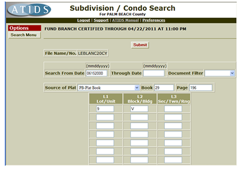
Discovery of WebATIDS
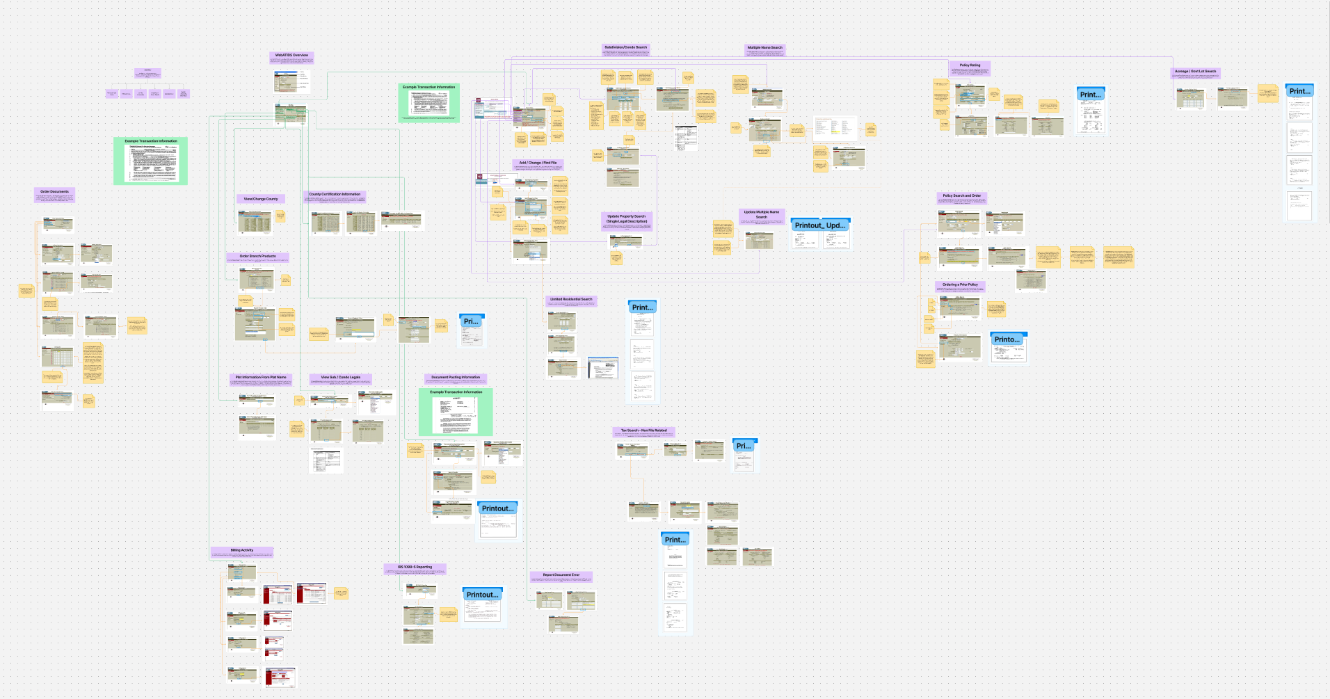
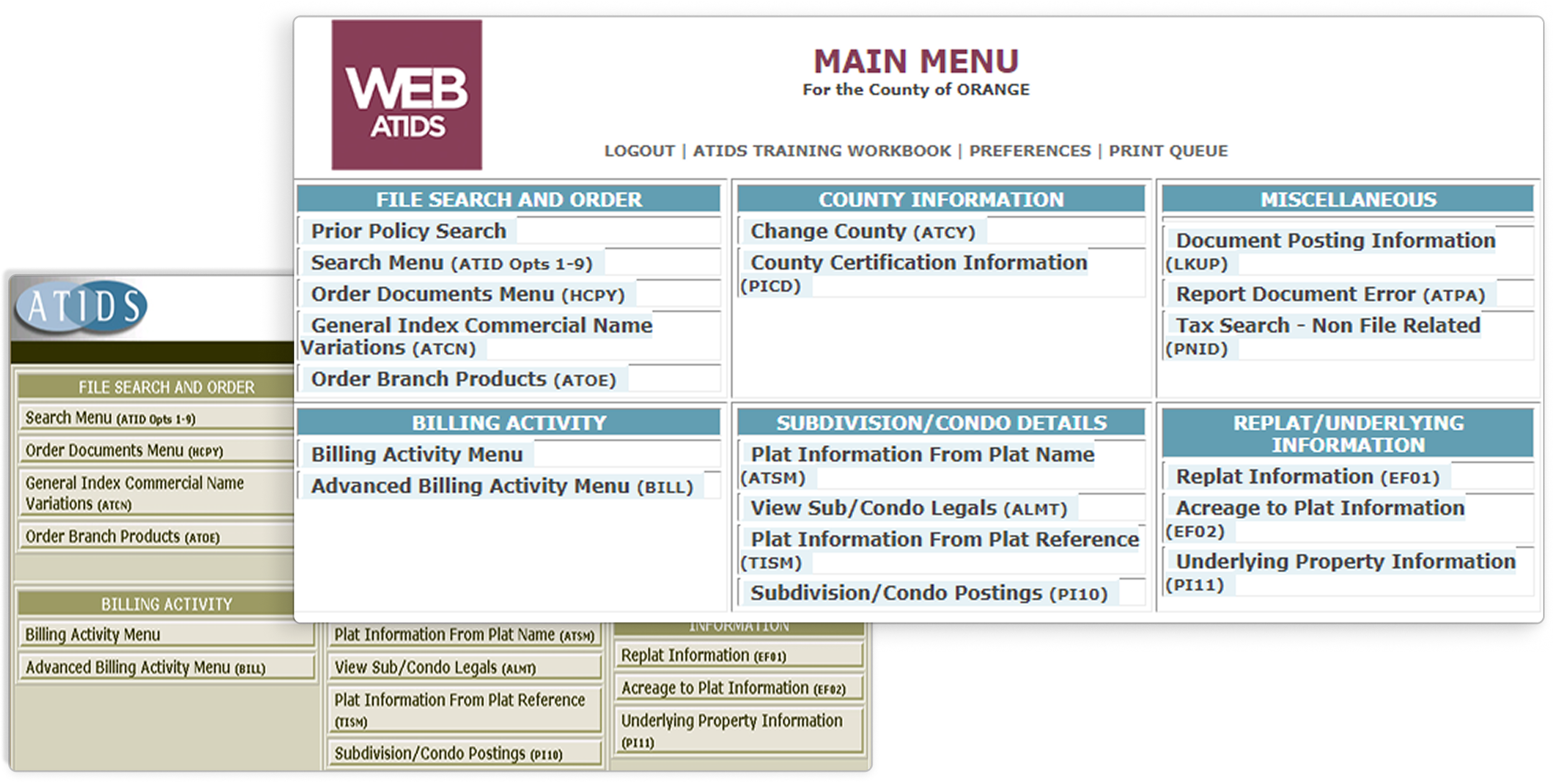
WebATIDS is a highly complex platform, designed with specific users in mind—those who are familiar with its intricacies. For example, a single screen in WebATIDS might leave users questioning the purpose of various fields. To better understand its structure, I delved deeper into WebATIDS core and mapped out the entire system on FigJam. This process not only clarified the original organization but also highlighted key areas where improvements can be made to enhance user experience.
User Flow
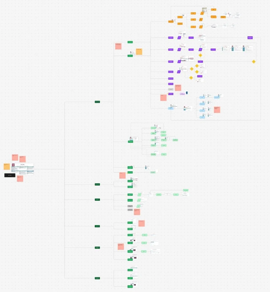
After gaining a clearer understanding of the search capabilities, I mapped out a user flow and organized the features based on their functionality. This approach provided clearer insights into how the Search MVP experience should be structured.
History of Redesign for WebATIDS
WebATIDS underwent a redesign, with the primary change being a shift in color styling. Notably, this update had no impact on the daily functions of existing users.
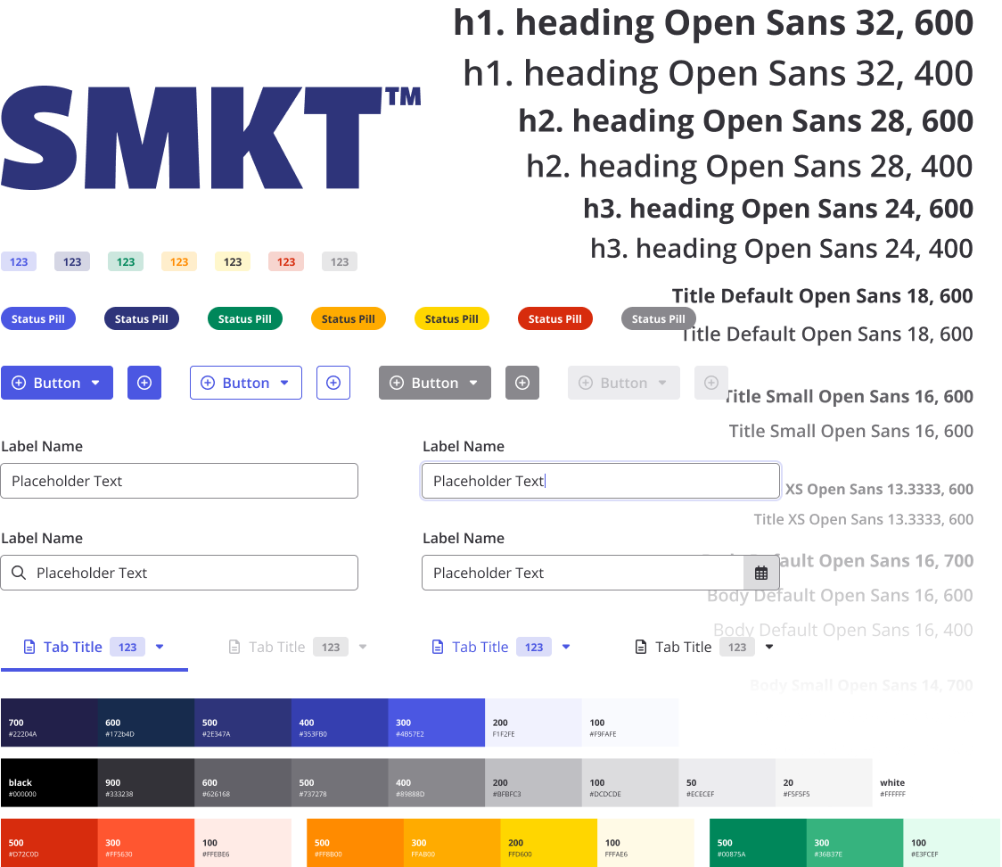
SMKT UI and Style Guide
Flexible, framework-free UI — built to be overridden, styled to fit any application
As Search MVP will be built by SMKT, I utilized their Design System — a flexible, framework-independent UI library designed for seamless CSS overrides across applications.
The Redesign 1.0
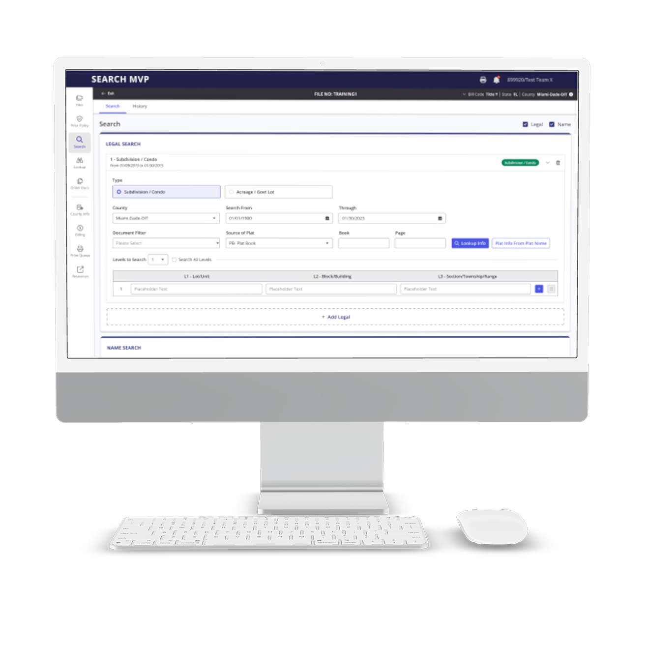
Main Navigation
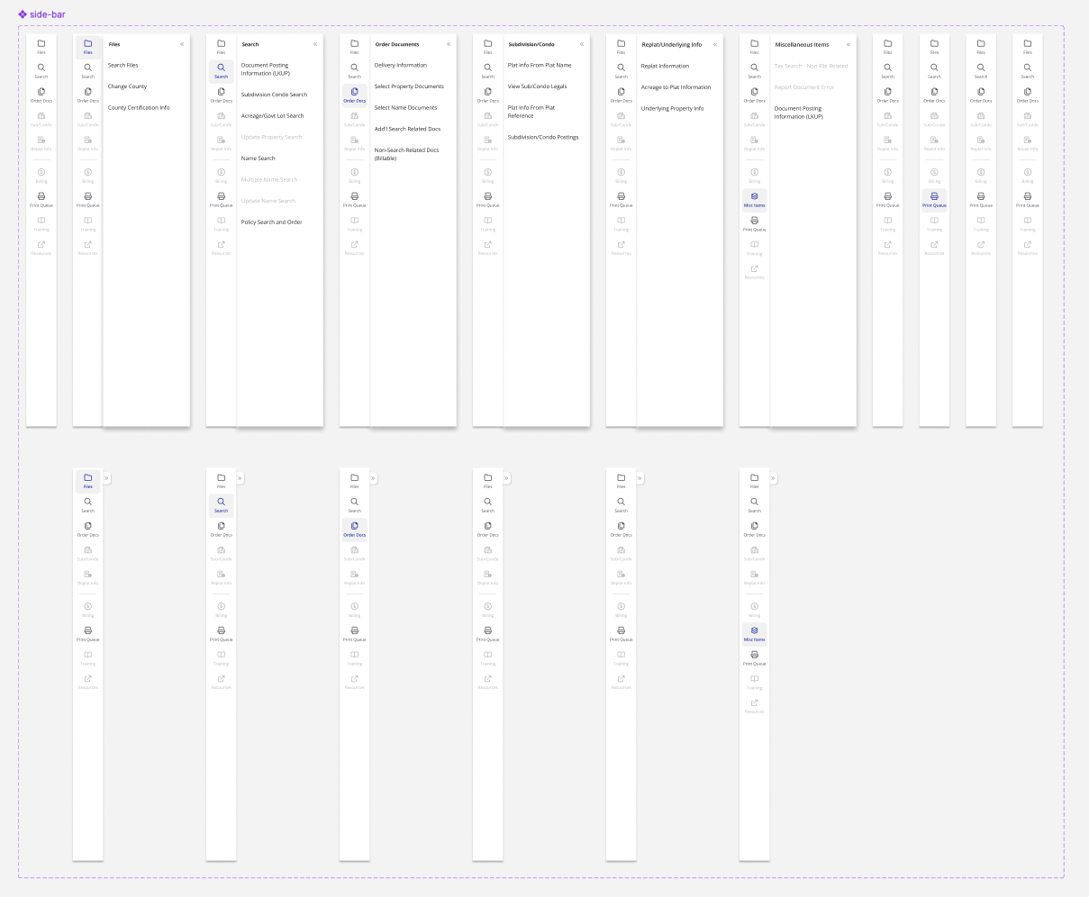
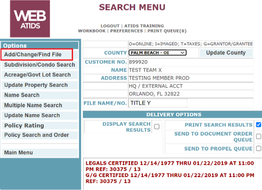
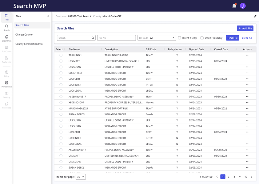
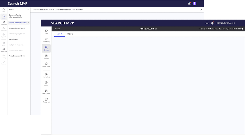
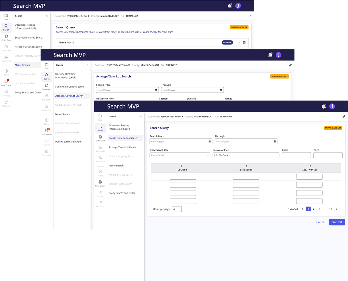
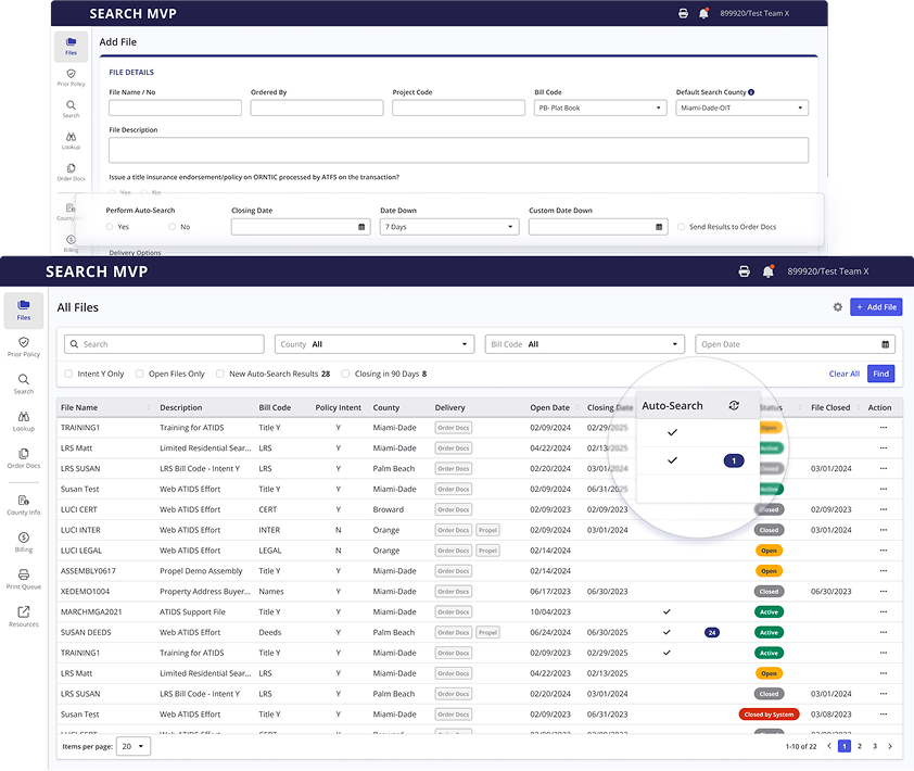
Based on the research and user flow, I designed a sidebar as the primary navigation, allowing users to easily access different sections without constantly returning to the main menu. For Phase I of the project, I was tasked on redesigning specific pages. I also included the future pages as disabled links in the sidebar to provide stakeholders with a clear view of what's coming and how they will navigate to those sections.
Before
WebATIDS lacks a file repository, requiring users to manually enter a file name or number for each search. There is no "Submit" button; instead, users must click the search option in the left panel after entering the file name or number. After each search, users are returned to the same page and must repeat the process.
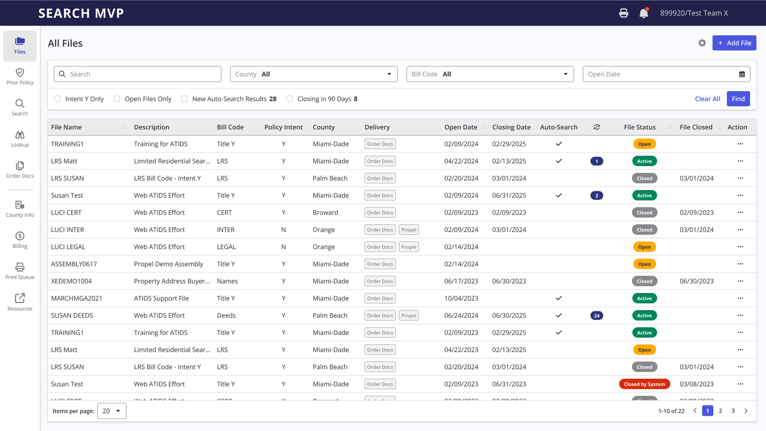
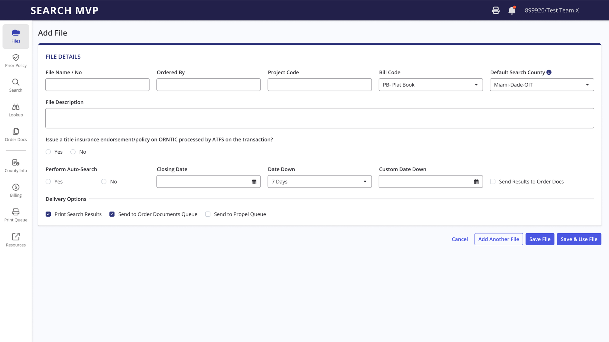
In the redesigned version, I introduced a file management feature that allows users to easily select and manage their files for searching. Users can now perform multiple searches using the same file, along with selected county and delivery options. Additionally, I added a secondary top navigation bar, enabling users to edit their selections without interrupting their search flow.
After
Feedback and Iterations
The redesign received positive feedback, particularly from The Fund, which owns WebATIDS. There was a lot of excitement around the updated look. However, the ORBIT team expressed concerns about how their data points would integrate, especially since ORBIT is not part of the MVP and had not provided any information at that time.
From a technical perspective, the collapsible sidebar presented challenges, as it’s not part of SMKT’s standard UI assets and could potentially cause responsiveness issues for some consuming applications.
Additionally, the development leads from The Fund released the API documentation for WebATIDS, but the SMKT development team found it challenging to navigate and understand how it would map to the redesigned interface.
In response to this feedback, my key tasks were:
- Investigate ORBIT and perform a compare/contrast with the Search MVP
- Support the developers by obtaining API documentation from Swaggerhub and tagging the mockups accordingly
- Redesign and streamline the navigation
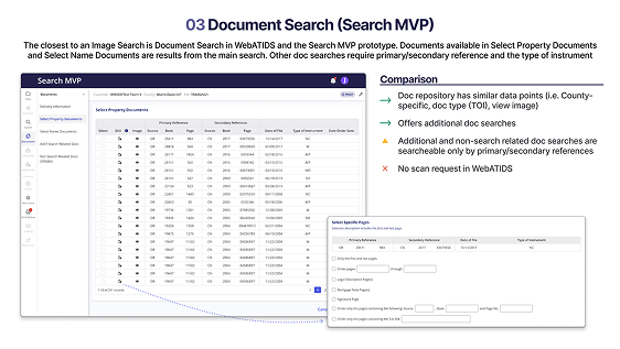
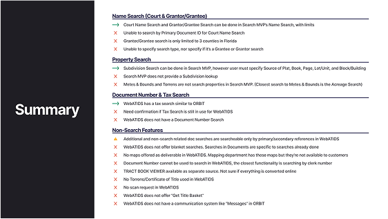
1. ORBIT/Search MVP Analysis
To make sure the mockup I created could scale to include ORBIT’s data points, I conducted a side-by-side analysis of ORBIT and the Search MVP, which was originally designed using WebATIDS data. At first glance, the two products appeared quite similar—but a deeper dive revealed key differences across multiple sections. I compiled a clear, unbiased presentation outlining these comparisons to help the team better understand the nuances. You can find the full breakdown of that analysis [here].
2. API Documentation
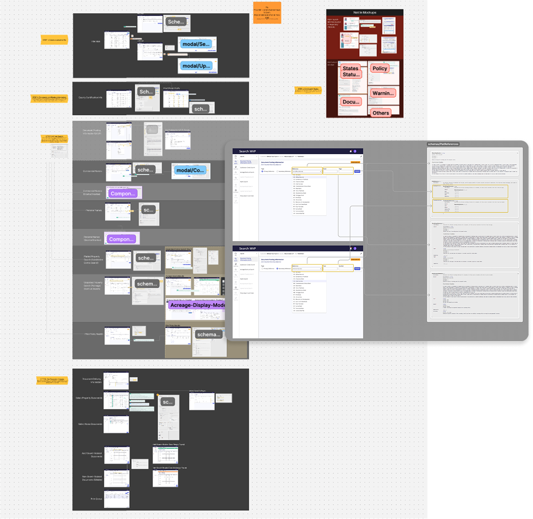
Getting access to The Fund’s API documentation was a key step in building out the next iteration. I immediately jumped in and tagged each field in the mockups with its corresponding schema, then documented everything in FigJam for the Product team and developers to reference. While reviewing the API, I noticed several endpoints were either duplicated or had overlapping functionality. I also came across features not present in WebATIDS core, which gave me valuable insight into how searches actually flow—and sparked ideas for improvements. Through a series of conversations, I learned that there are two other versions of WebATIDS: a “lite” version embedded in another product, and ATIDSXE. The API docs ultimately became our source of truth for what data points we could leverage in the Search MVP, even beyond what WebATIDS core currently offers. That discovery opened the door to more consolidation and a smarter redesign.
3. Redesign 2.0
The collapsible sidebar was well-received by stakeholders and the product team, offering a more approachable and less overwhelming experience than the original layout. However, the volume of navigation items still posed cognitive load concerns. Drawing from the API tagging insights and continued alignment with the product team, we identified clear opportunities to consolidate and simplify the navigation—improving usability and supporting a more intuitive flow for users.
Less Clutter, More Clarity
In the updated layout, I streamlined the sidebar by removing the expandable drawer and shifting secondary navigation to a top-down pattern. This approach improves responsiveness across screen sizes and creates a more spacious, focused working area for users.
Streamlined Workflows, and a Framework Built to Scale
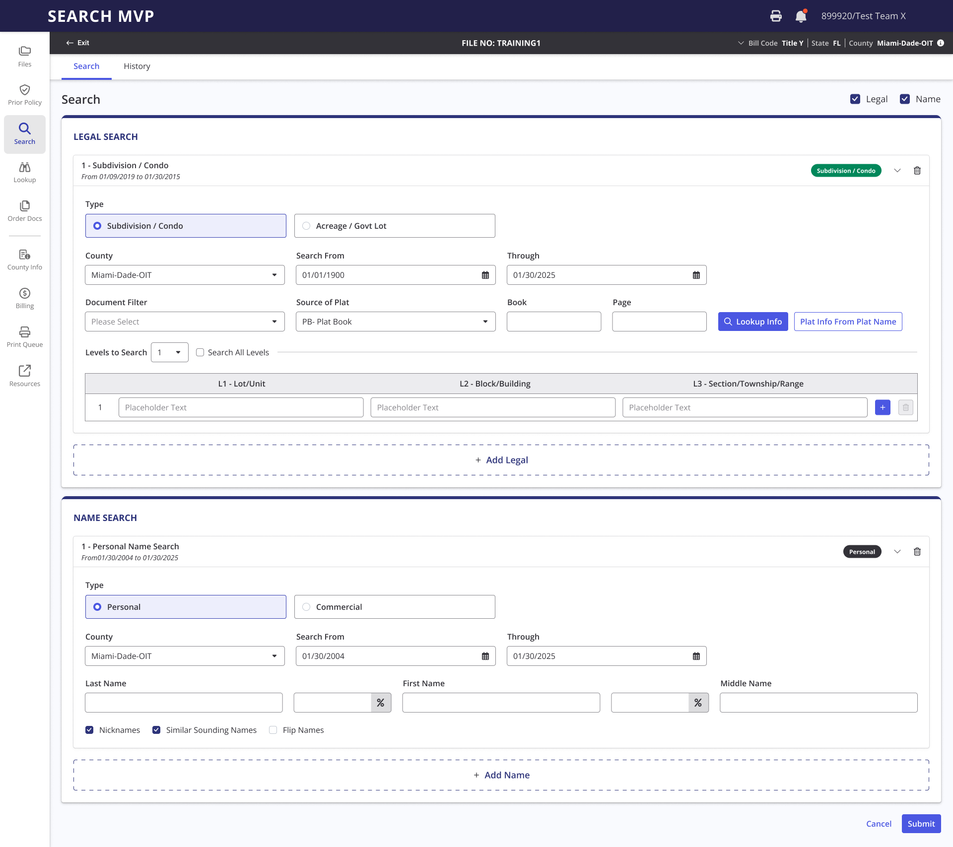
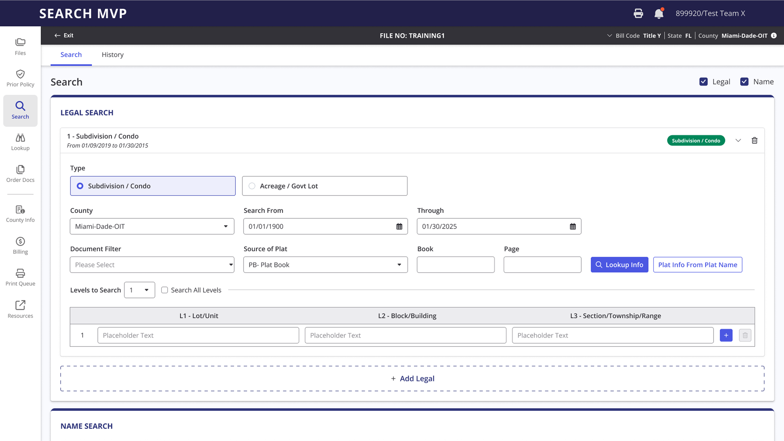
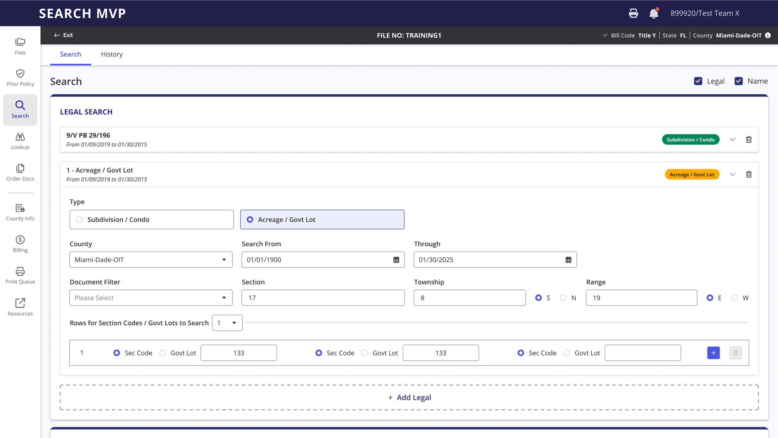
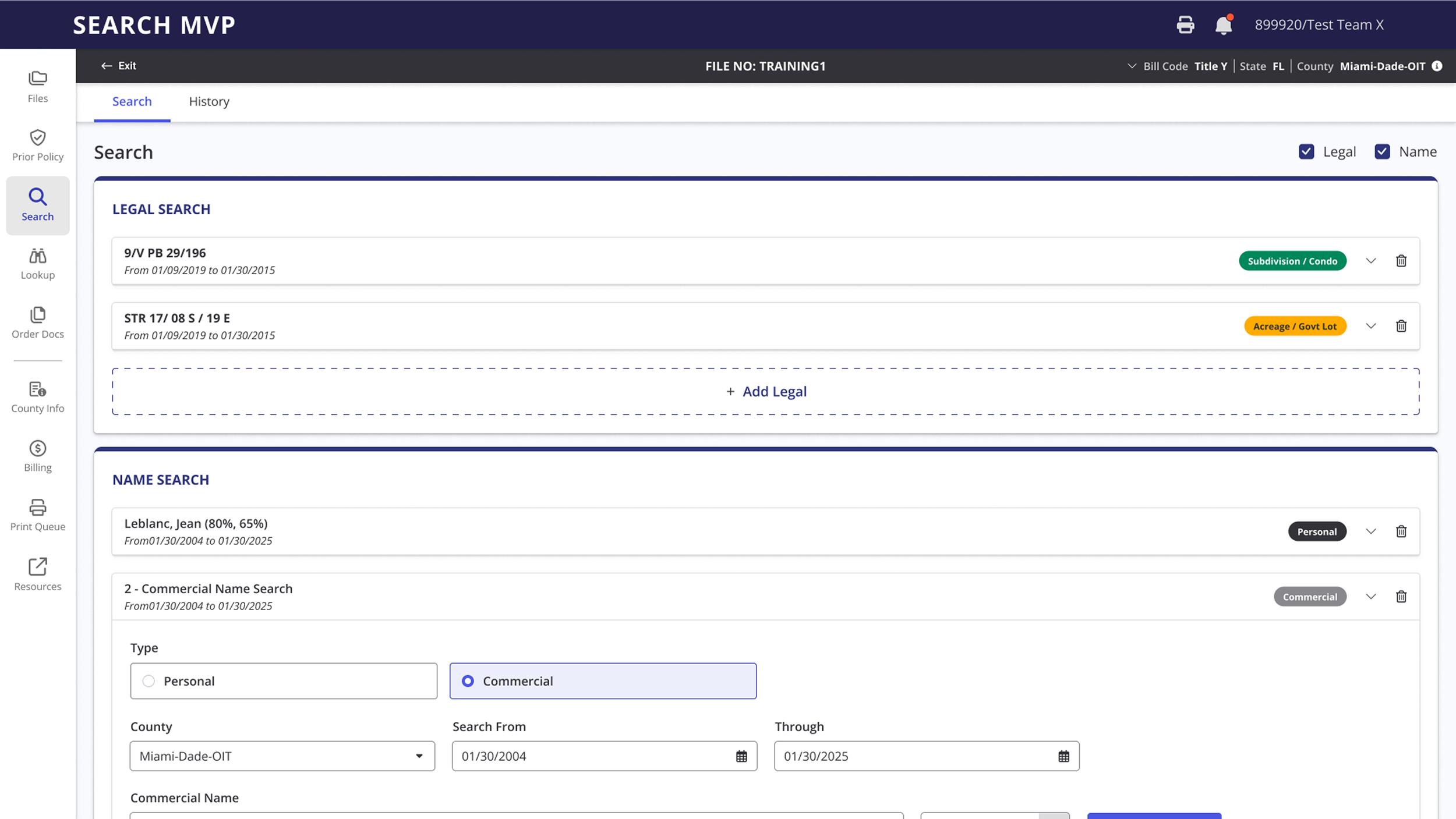
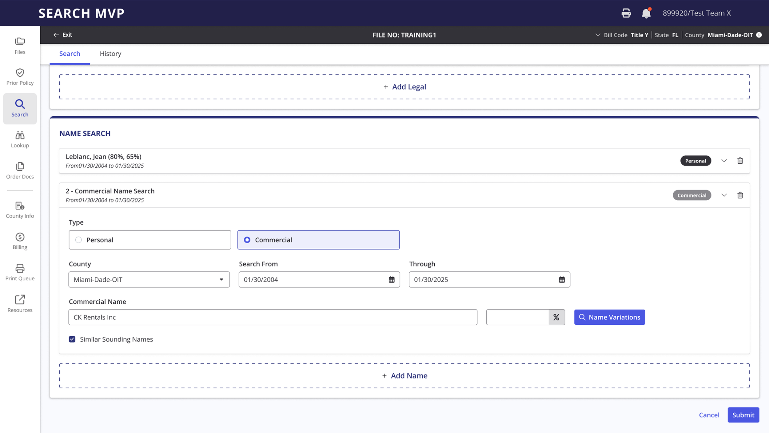
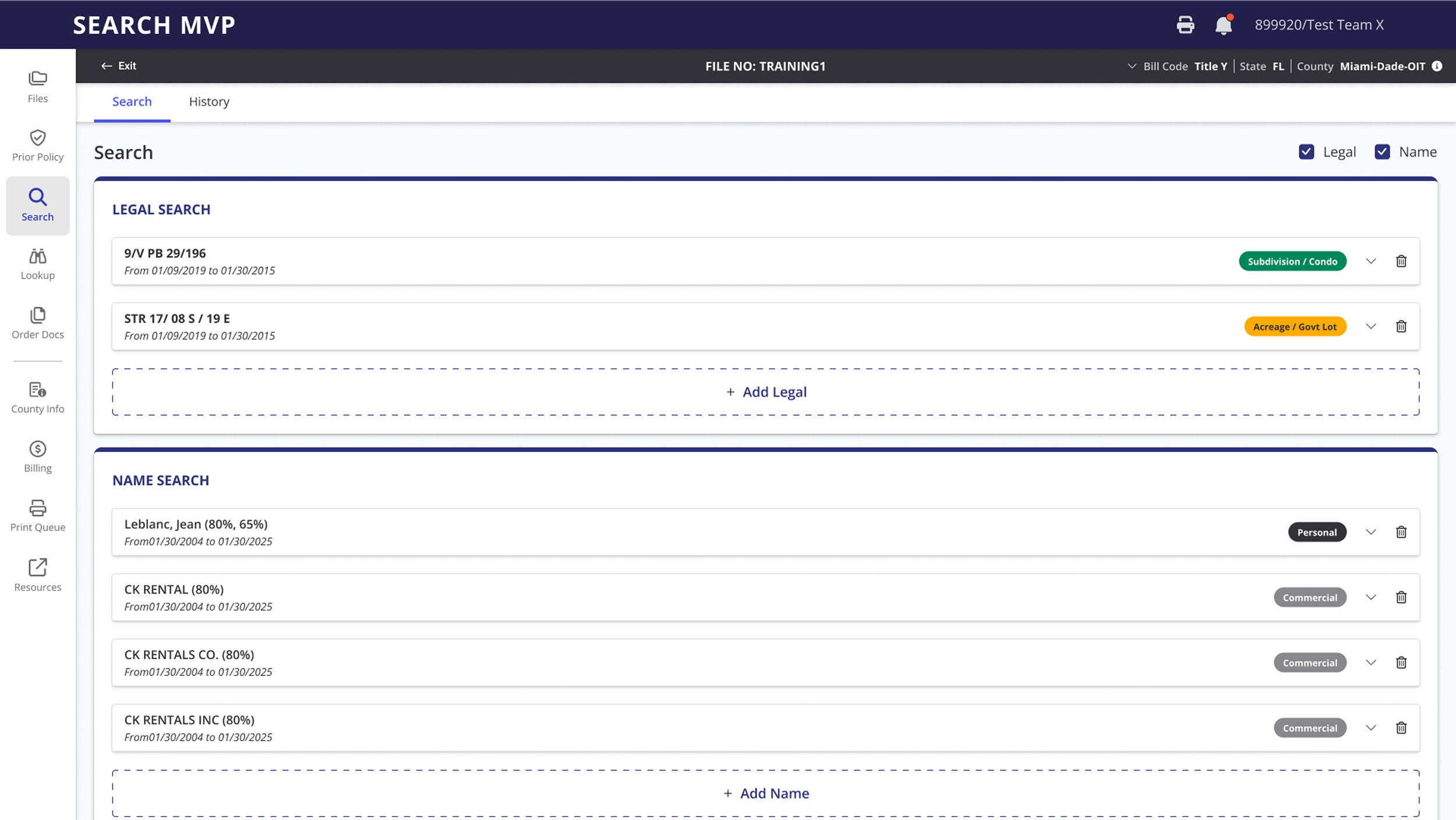
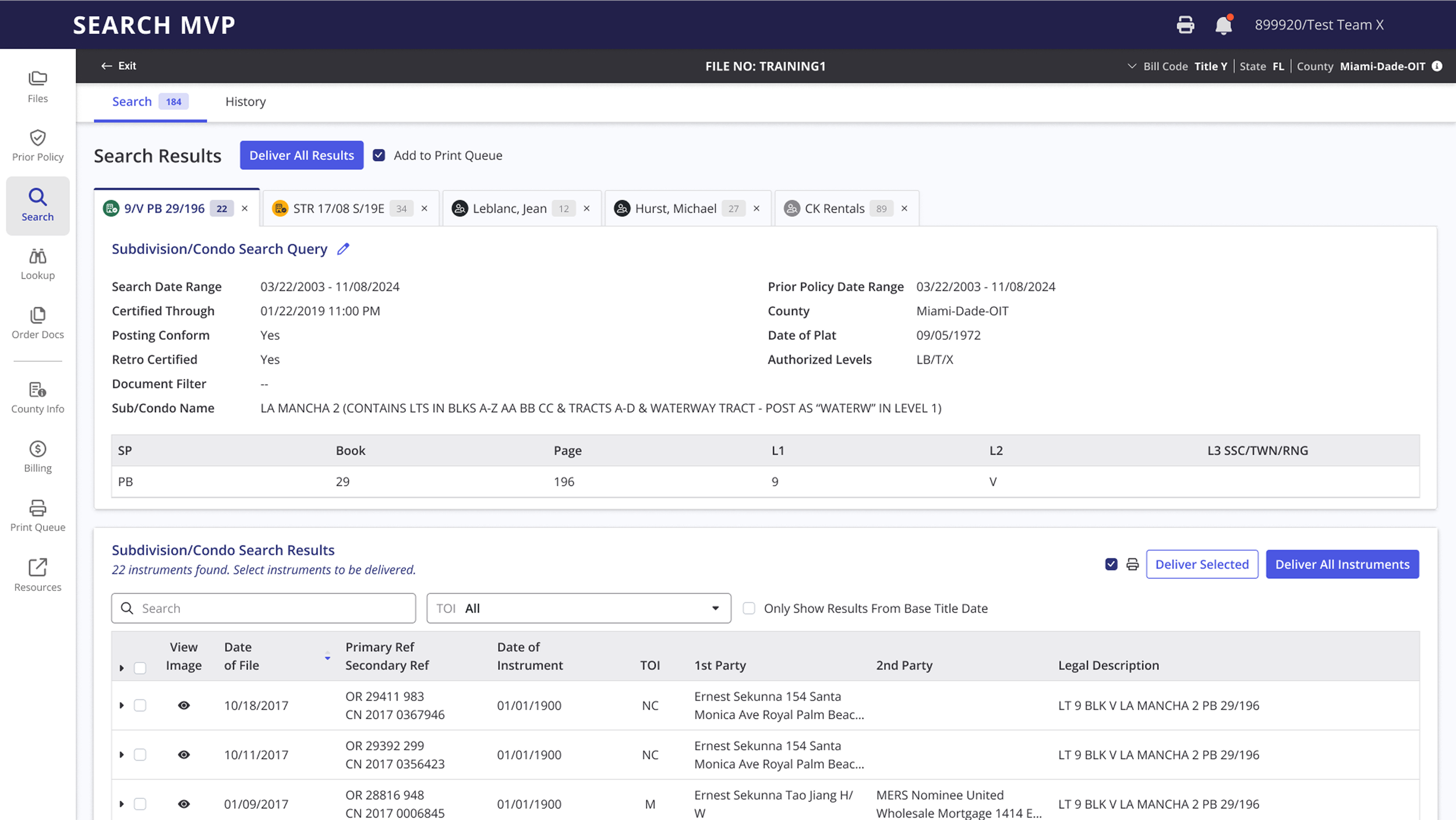
In the earlier design, searches were separated within the sidebar, mirroring the legacy experience. After a series of deep dives with Subject Matter Experts (SMEs) to uncover real-world use cases—and alignment sessions with the product team on intended workflows—I reimagined the experience as a unified, full-form layout. Users can now run a single search or multiple searches simultaneously within one streamlined interface. I introduced a modular card-based format for each search section, making components reusable and easily adaptable for future integrations like ORBIT. This structure allows data fields to be swapped or extended without significant UI changes. The update not only enhances task efficiency by reducing friction and clicks but also establishes a scalable framework for cross-platform use cases, with fields pre-populated from linked files so users can access and act on comprehensive data in a single, high-visibility view.
Optimizing Search by Centralizing and Contextualizing Tools
In Redesign 1.0, my initial scope was limited to refreshing a few key pages, primarily focused on the main search function. In the original experience, most of the disabled navigation links pointed to separate search tools intended to help users find supporting documentation and related information.
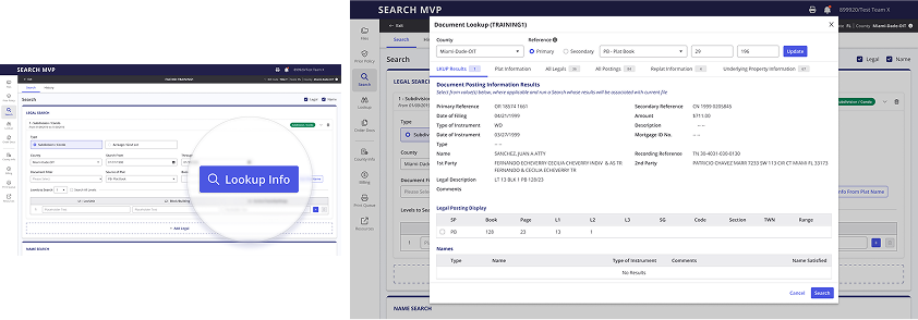
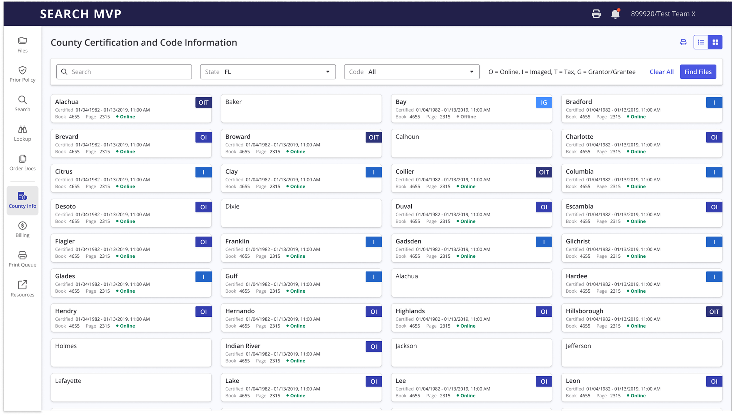
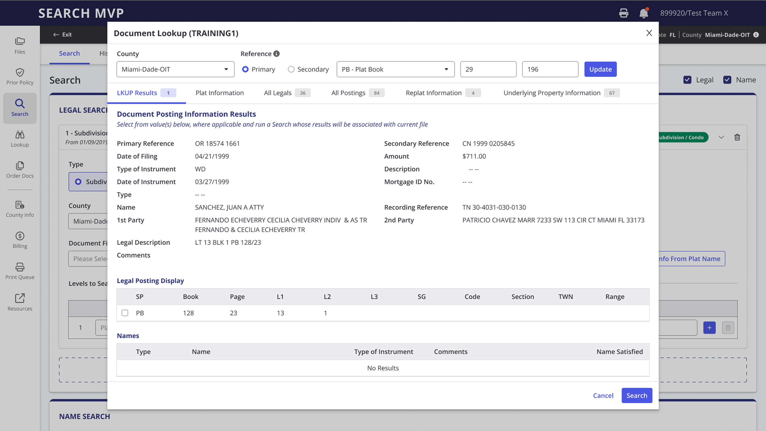
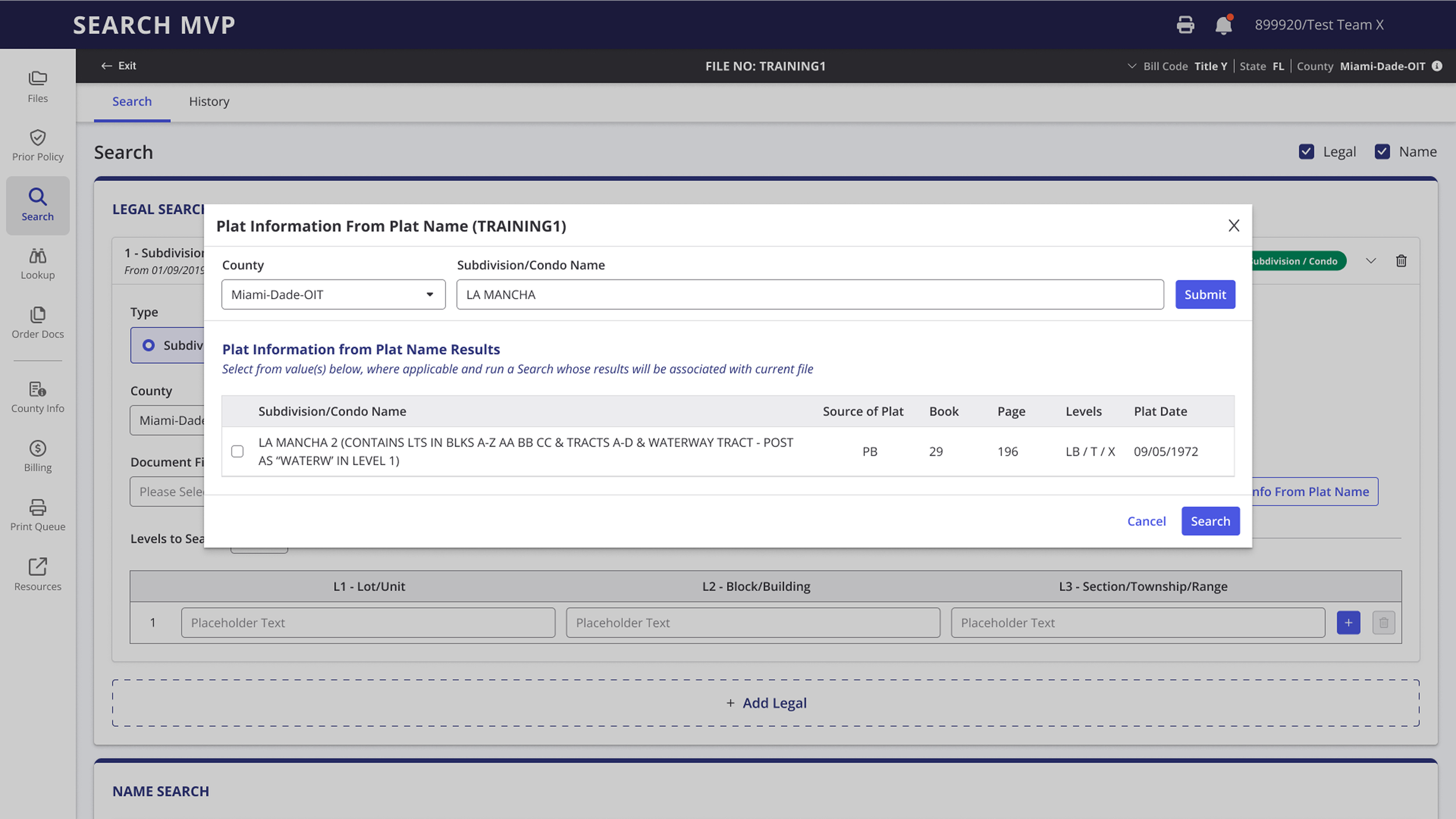
After reviewing how ORBIT integrated their “Lookup” function directly within the main search workflow, I saw an opportunity to apply a similar concept. Instead of forcing users to leave their search flow to access supporting tools, I consolidated those functionalities directly into the main search interface. This approach minimizes unnecessary clicks, eliminates repetitive data entry, and keeps users focused within a single, uninterrupted workflow.
To validate feasibility, I consulted the API logs via SwaggerHub and confirmed the necessary endpoints were available. With just a few added action buttons, users can now input their initial data and run related lookups with a single click—viewing, selecting, and applying relevant results without navigating through five different tools. This not only improves task efficiency but also simplifies the overall search experience by keeping everything contextually connected.
The same Lookup Tool was also elevated to a higher-level position in the navigation bar, giving users the flexibility to access it outside of a file-specific context. From there, users can view or print results, or initiate a search by selecting a file directly within the tool.
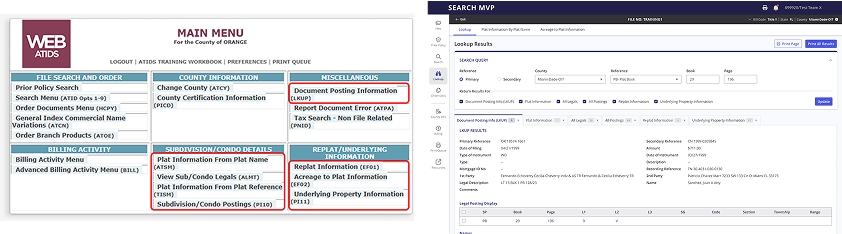
In the current WebATIDS experience, these search tools existed as separate utilities, each requiring individual searches and returning isolated results. In the redesign, all of these tools have been consolidated into a single, unified interface—streamlining workflows, reducing context switching, and creating a more cohesive, efficient user experience.
Empowering Users with Auto-Search Capabilities
Through the second discovery phase, I identified an opportunity to improve efficiency by introducing an auto-search function — a concept I developed to help users save time by entering their search criteria once and letting the system automatically run recurring searches until a user-defined end date. Although the current API from The Fund didn’t support this capability, I recognized its potential value. I pitched the concept to stakeholders and the product team, and it was enthusiastically received as a fresh, innovative enhancement they agreed would add meaningful value to the product’s roadmap.
Final Design

Conclusion
Search Smarter. Work Faster. Scale Bigger.
Search MVP was a complex but rewarding project that highlighted the critical importance of cross-product collaboration, alignment between diverse teams, and balancing modern UX principles with long-standing user habits. Both WebATIDS and ORBIT are legacy products built with low UX maturity but have been deeply ingrained in users’ workflows for decades. The challenge wasn’t just in redesigning an interface — it was in navigating deeply rooted expectations from both users and product teams resistant to change.
This project became a two-way education process: I immersed myself in the product’s functional requirements and constraints, while also advocating for a more modern, efficient, and scalable user experience through consolidation, automation, and smart interface patterns. By bringing in SMKT to support the integration, we made this modernization possible.
For Search MVP, I delivered a final design that streamlines the title search process for the state of Florida, while laying the groundwork for incorporating Kansas and Minnesota through ORBIT — with an eventual goal of scaling the platform to support all 50 states. Though Search MVP marks a significant milestone, it’s clear this design is only the beginning. Future iterations will continue to evolve as new needs and opportunities emerge.