
Vinca – Order Entry
Redesigned Vinca’s Order Entry section, modernizing the legacy UI into a SaaS-ready experience aligned with Old Republic Title’s design system while preserving core functionality for existing users.
Product Overview
Figma
ADO
Citrix
Role
Vinca is a B2B vendor management software platform designed for real estate servicing institutions and vendor management companies. It streamlines internal workflows, reduces processing costs, and improves service quality by supporting customizable product configurations, compliance with state regulations, and efficient fulfillment of high-volume or bundled service orders.
- Product Strategy
- Product Design
- User Experience
- User Research

A modern redesign for smarter, more efficient Order Entry.
The team and I were tasked with redesigning the Order Entry section of Vinca as part of an MVP. The goal was to modernize Vinca—an existing, legacy software used by current clients—by implementing a sleek new UI that aligned with the branding and style guide of its parent company, Old Republic Title. We ensured that no functionality from the original Vinca was lost during the process.
As part of the rebranding, the stakeholders decided to phase out the Vinca logo and use a placeholder logo from LSG until marketing finalized a new one. The redesign also aimed to transition Vinca from traditional software to a SaaS product. The user interface was built using the Old Republic Title Design System, based on the Telerik/Kendo framework.
The Research Process
Discovery & Content Audit
To kick off the redesign, I began by gaining insights into the current product through several walkthroughs with the product managers. During these sessions, I identified a significant amount of manual work and unnecessary clicks in the workflow. To better understand the UI interactions, I requested access to the QUA environment on Citrix, allowing me to explore and observe firsthand.
My research also included reviewing documentation on the existing Vinca Vendor Management System, gathering information about the user base, and holding recurring discussions with the product, development teams, and stakeholders.
Based on these findings, my primary focus for the redesign were

Streamlining the user experience by reducing manual steps and eliminating unnecessary clicks

Ensuring tasks could be completed more efficiently by optimizing workflows

Addressing user needs and system limitations to enhance both usability and functionality
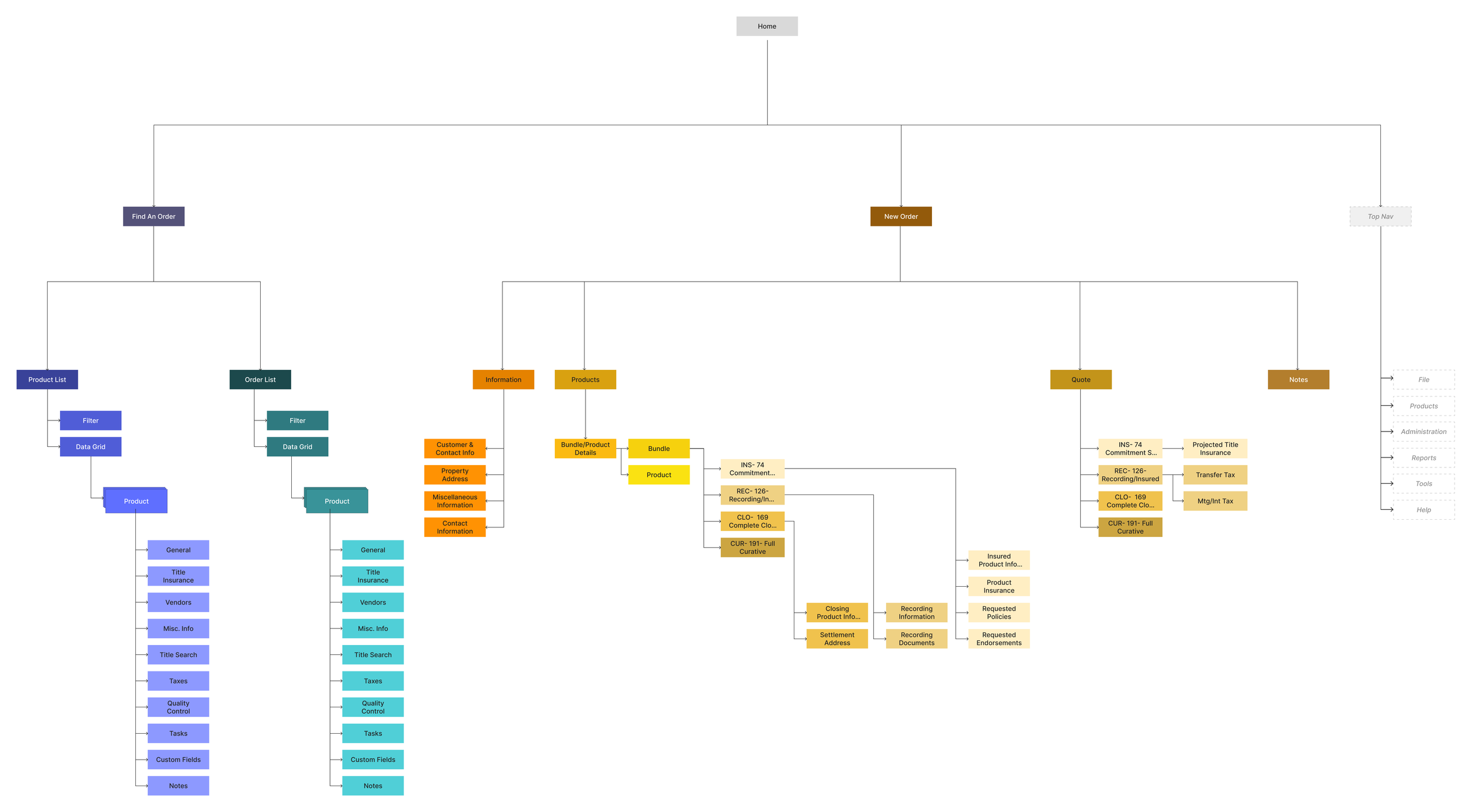
Site Map
Due to the complexity of the existing system, I developed a high-level site map to outline the key functionalities that needed to be preserved in the redesign. This helped highlight redundancies and areas where consolidation was possible.
UI and Style Guide
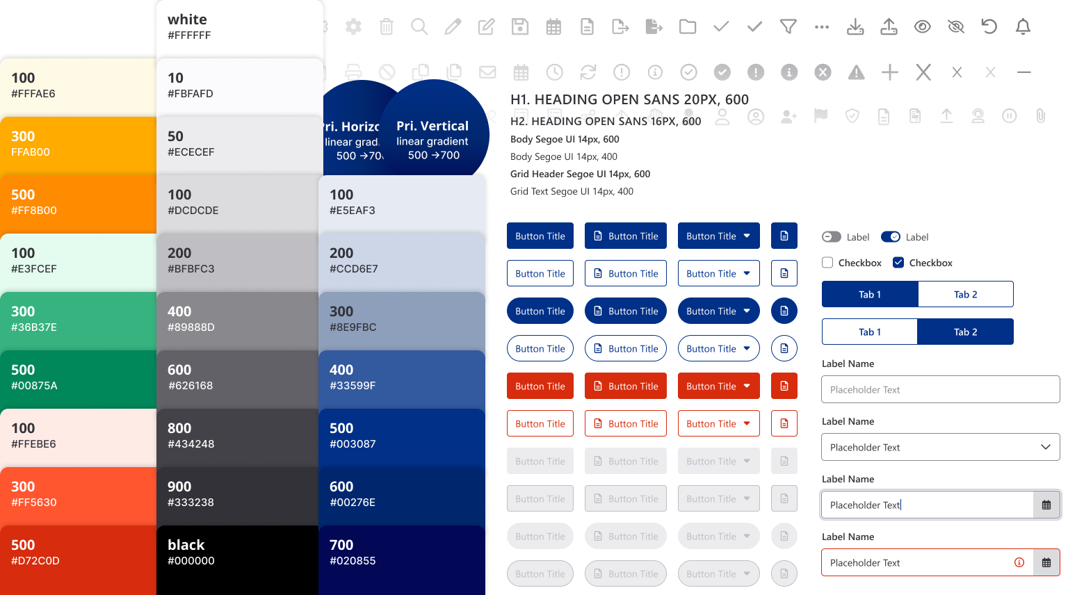
Ensuring Consistent Branding with ORT Products
Leveraging assets from the existing ORT Design System, I developed a UI kit and style guide for the project, incorporating FontAwesome icons and the Telerik framework. This ensured a consistent, branded experience aligned with other ORT products.
The Redesign
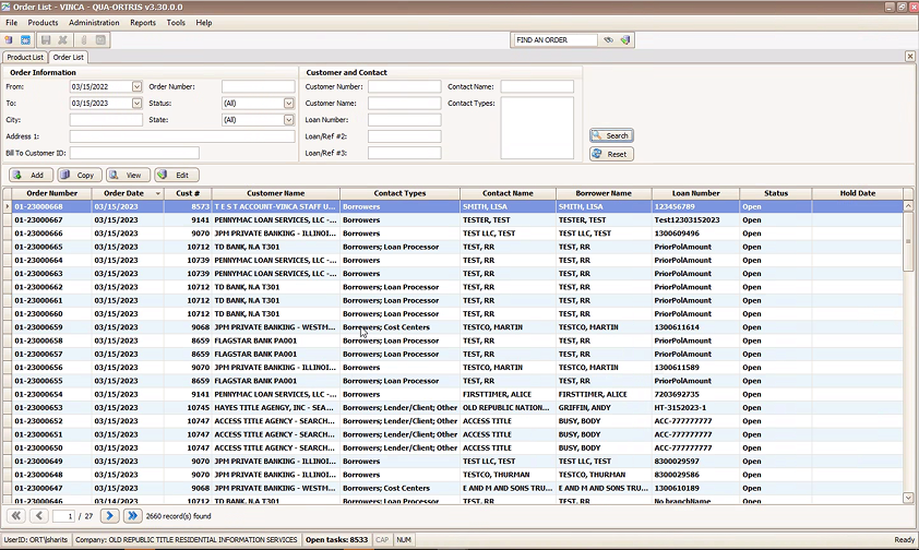
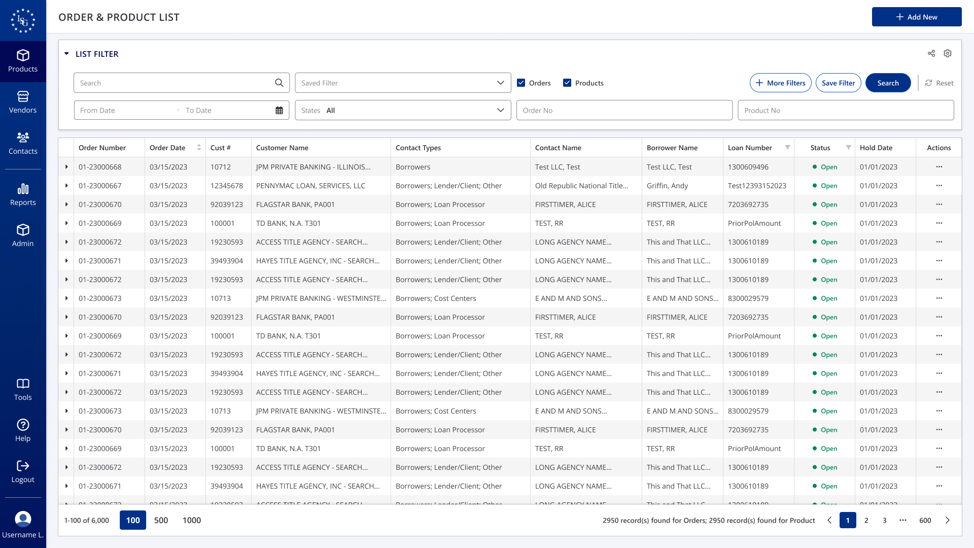
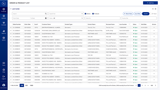
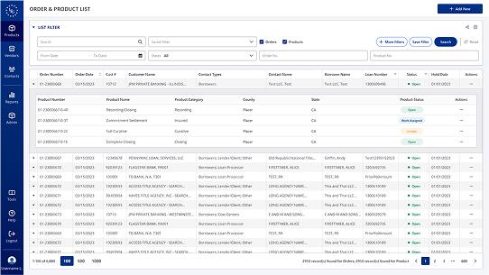
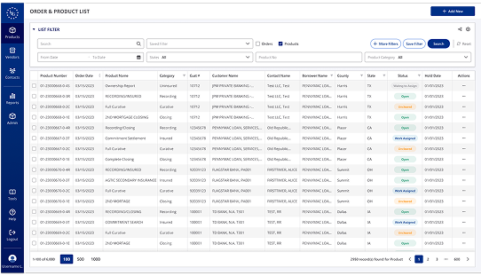
Order & Product Lists
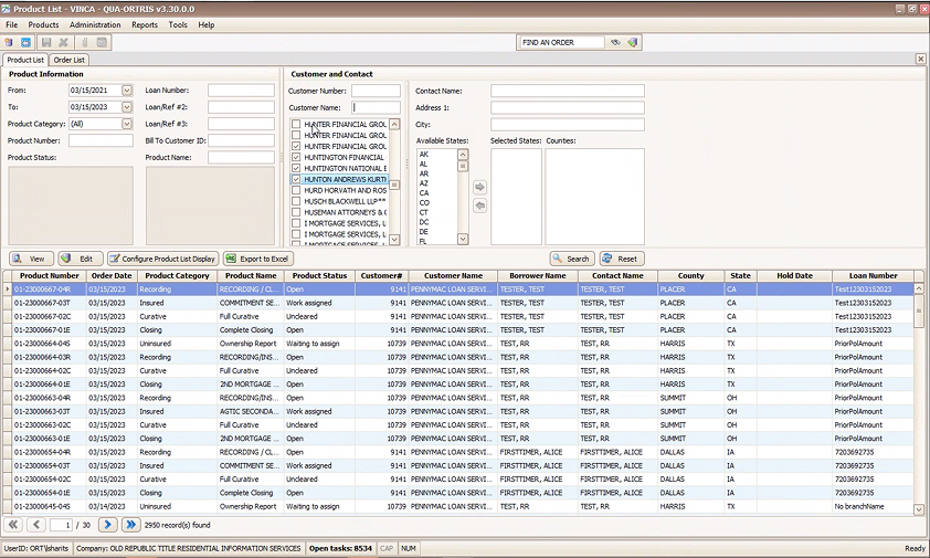
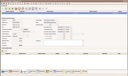
In the legacy version, Products and Orders were displayed in separate grids, each with its own search function. One detail that stood out was the product numbering system, which appeared to correlate with order numbers. Through product knowledge sessions and follow-up questions, I confirmed that products are always tied to a parent order, and that every order contains one or more products.
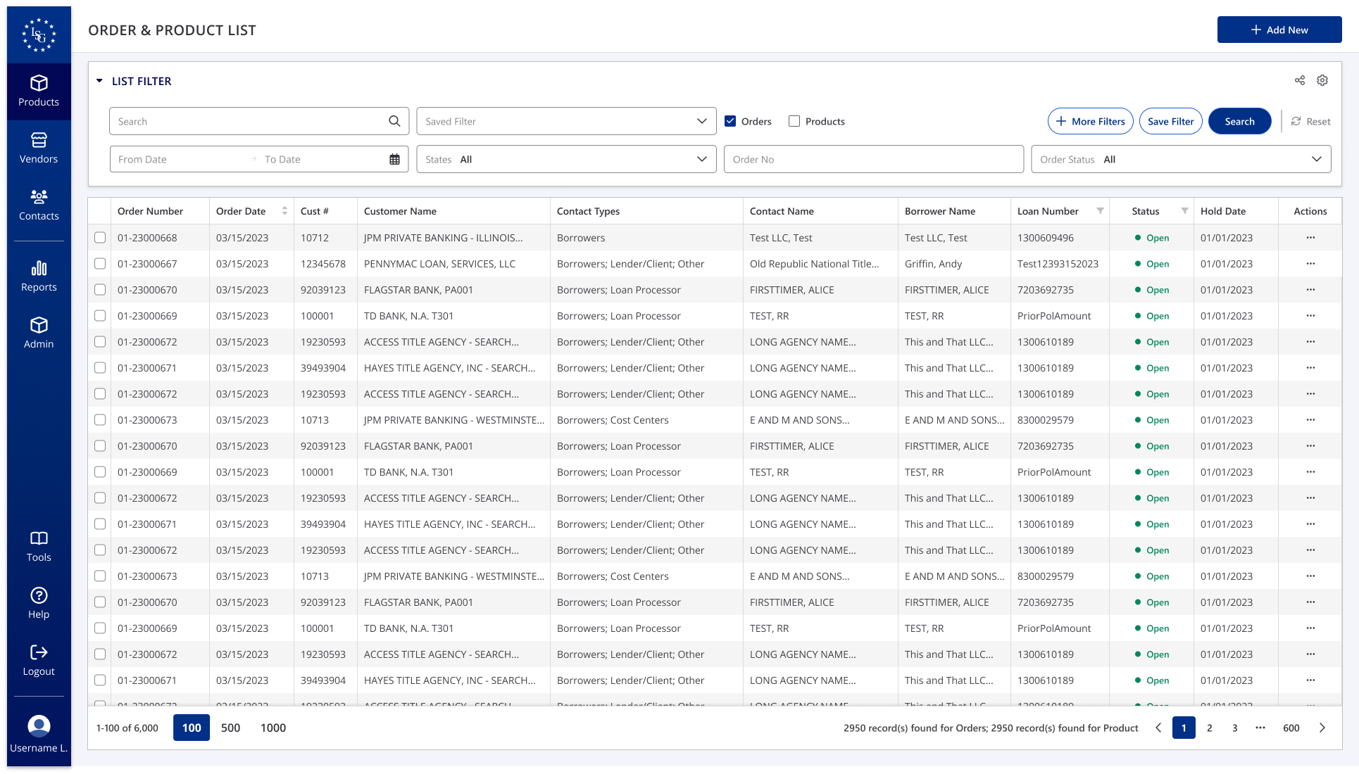
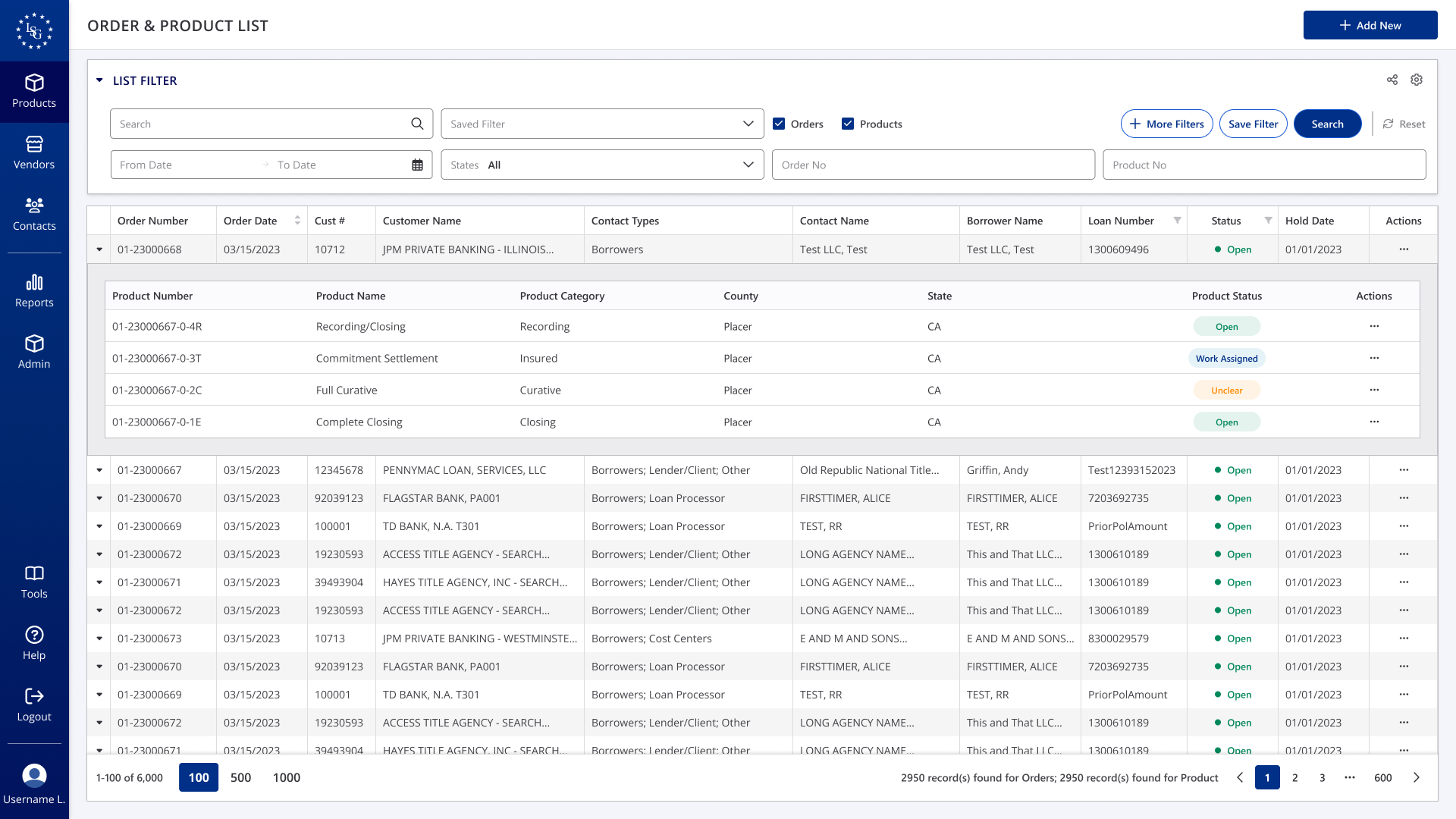
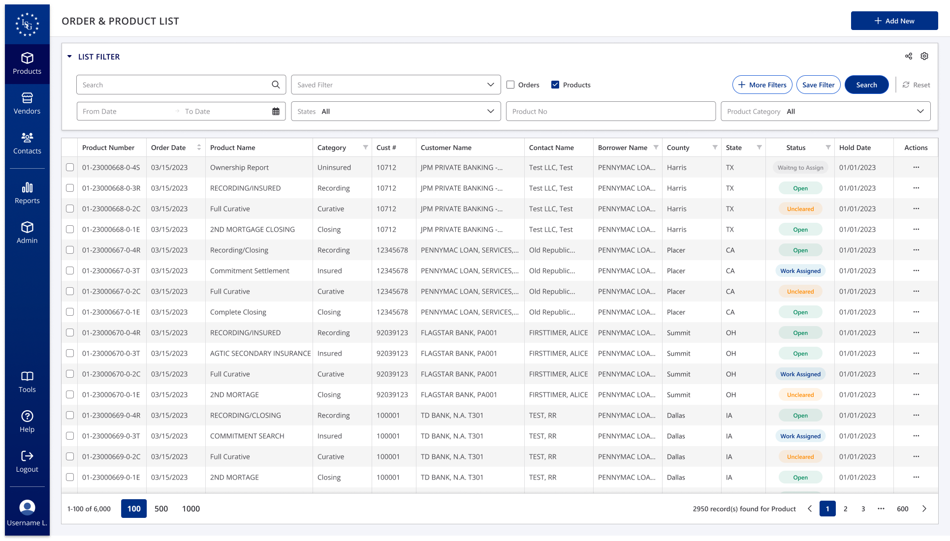
To streamline the experience, I explored Telerik’s table components and implemented an expandable grid that nests products under their corresponding orders. This eliminated the need for users to search in two separate places. I also simplified the filters based on customer usage data and added the option to filter by orders or products individually.
Before
After
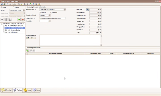
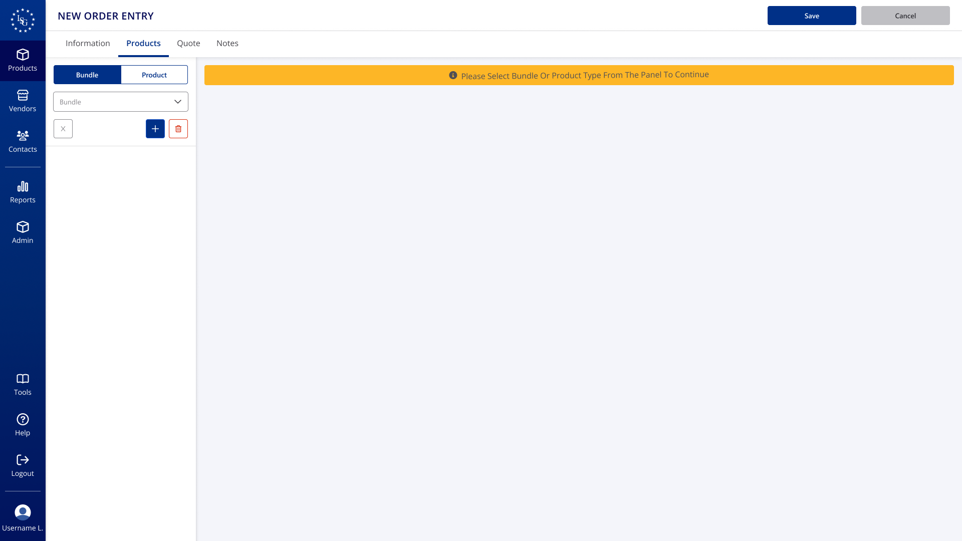
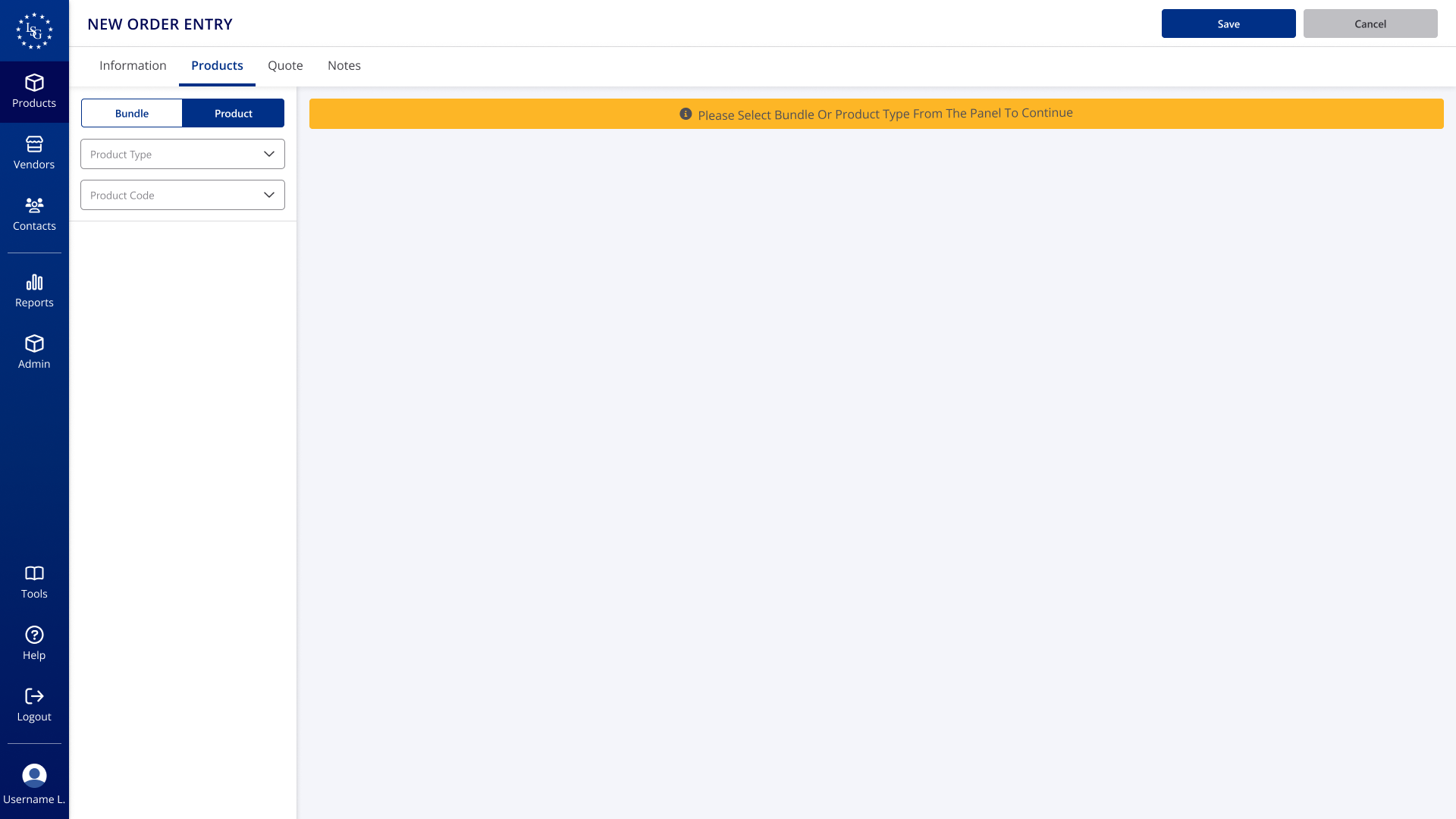
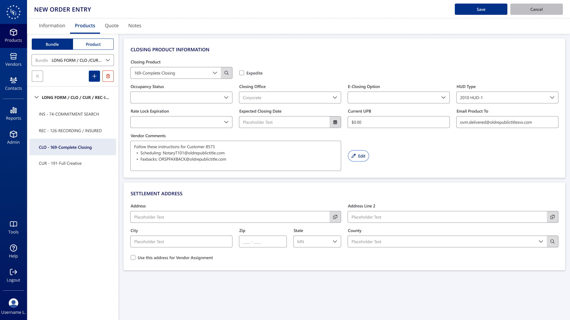
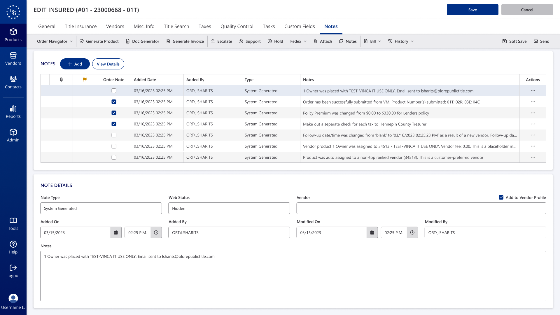
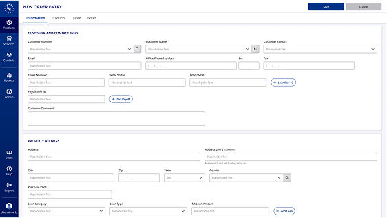
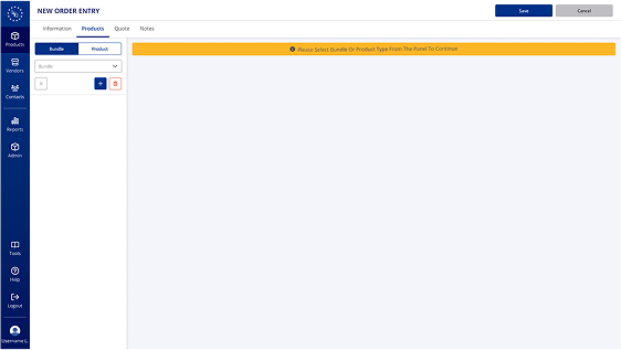
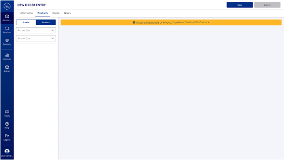
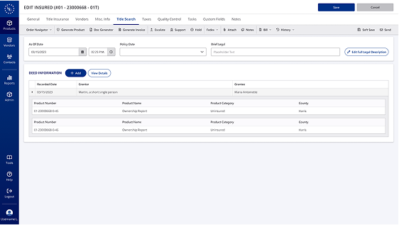
Order Entry
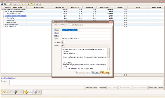
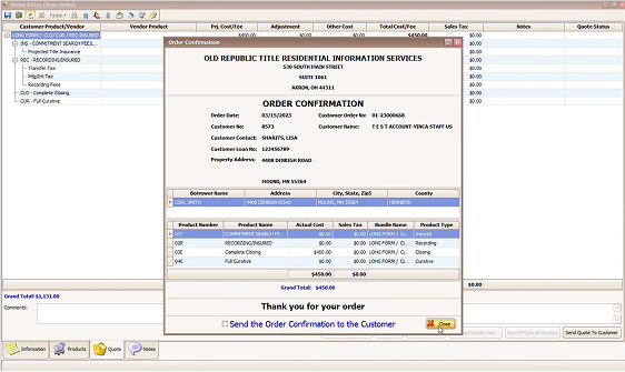
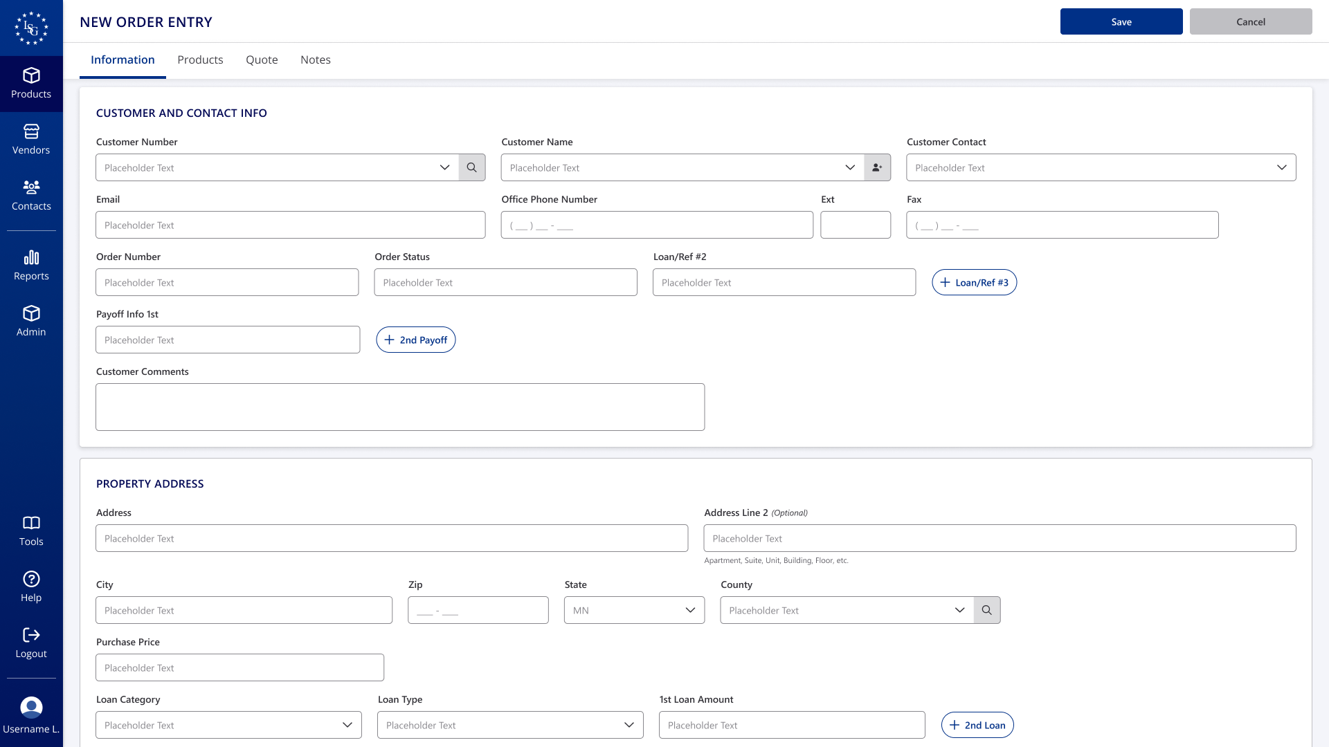
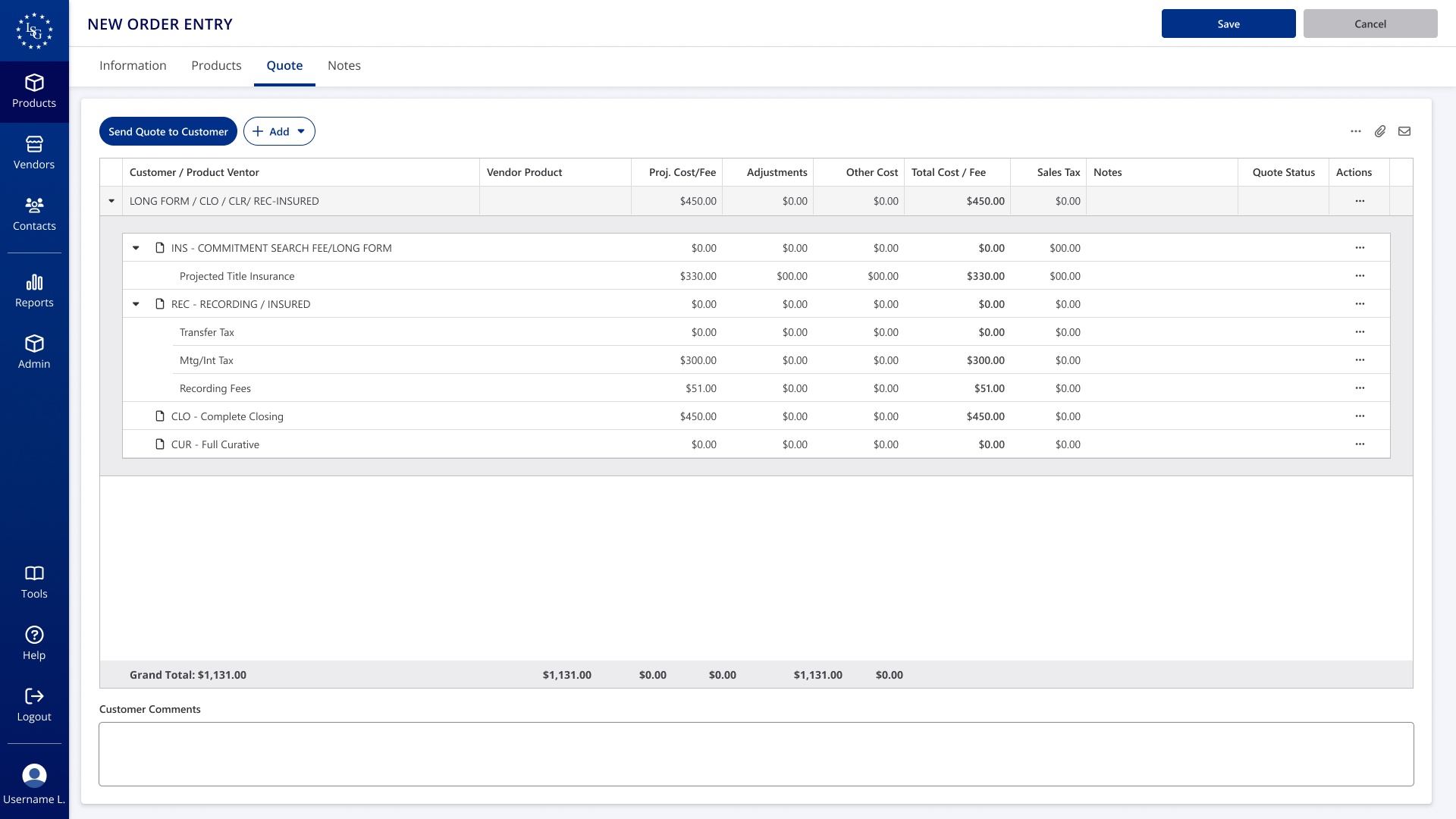
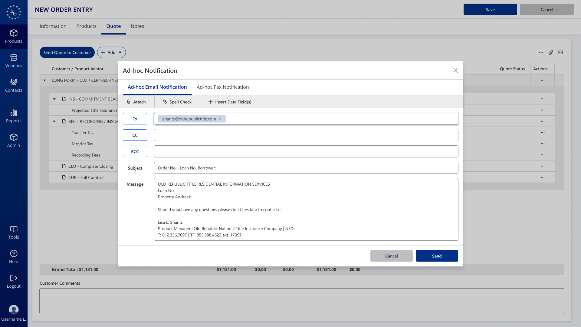
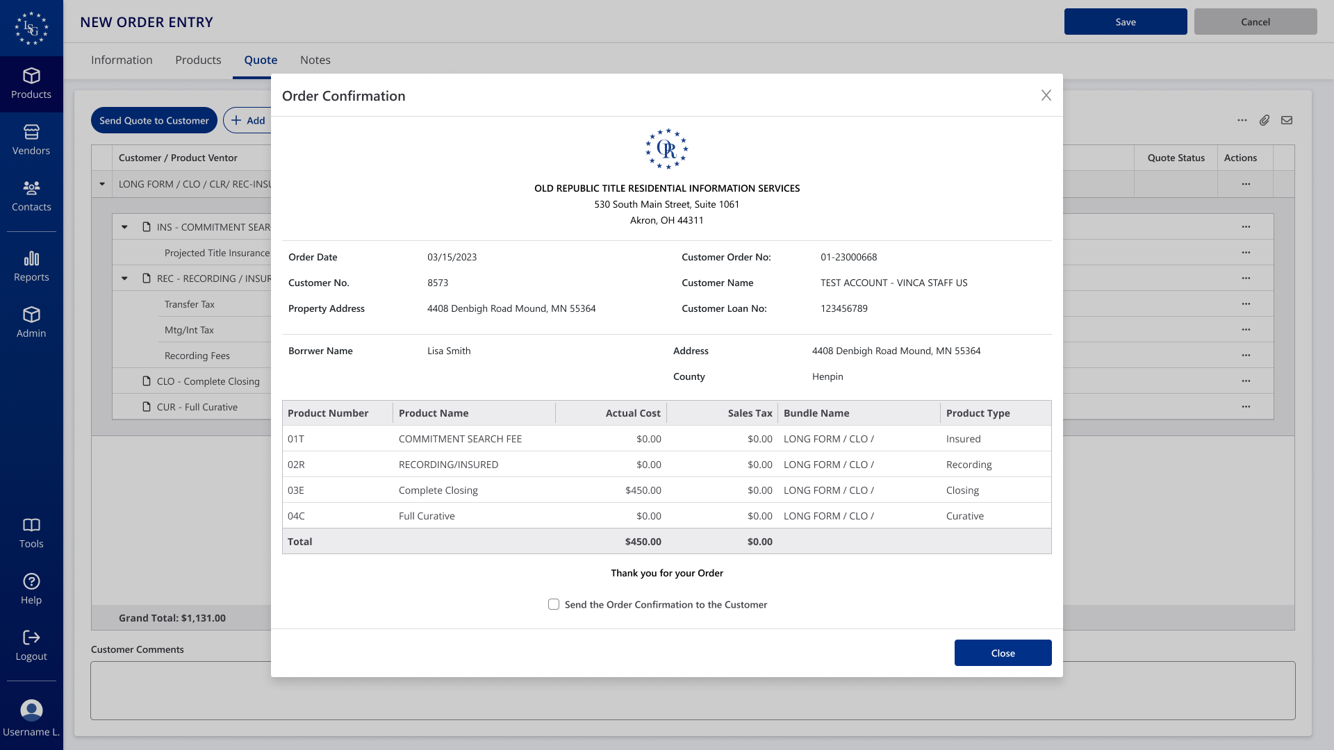
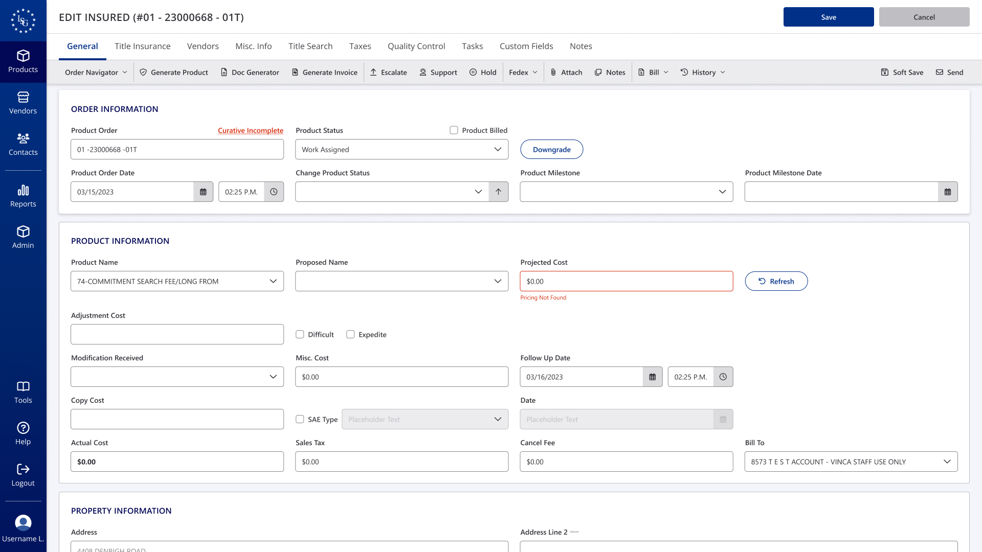
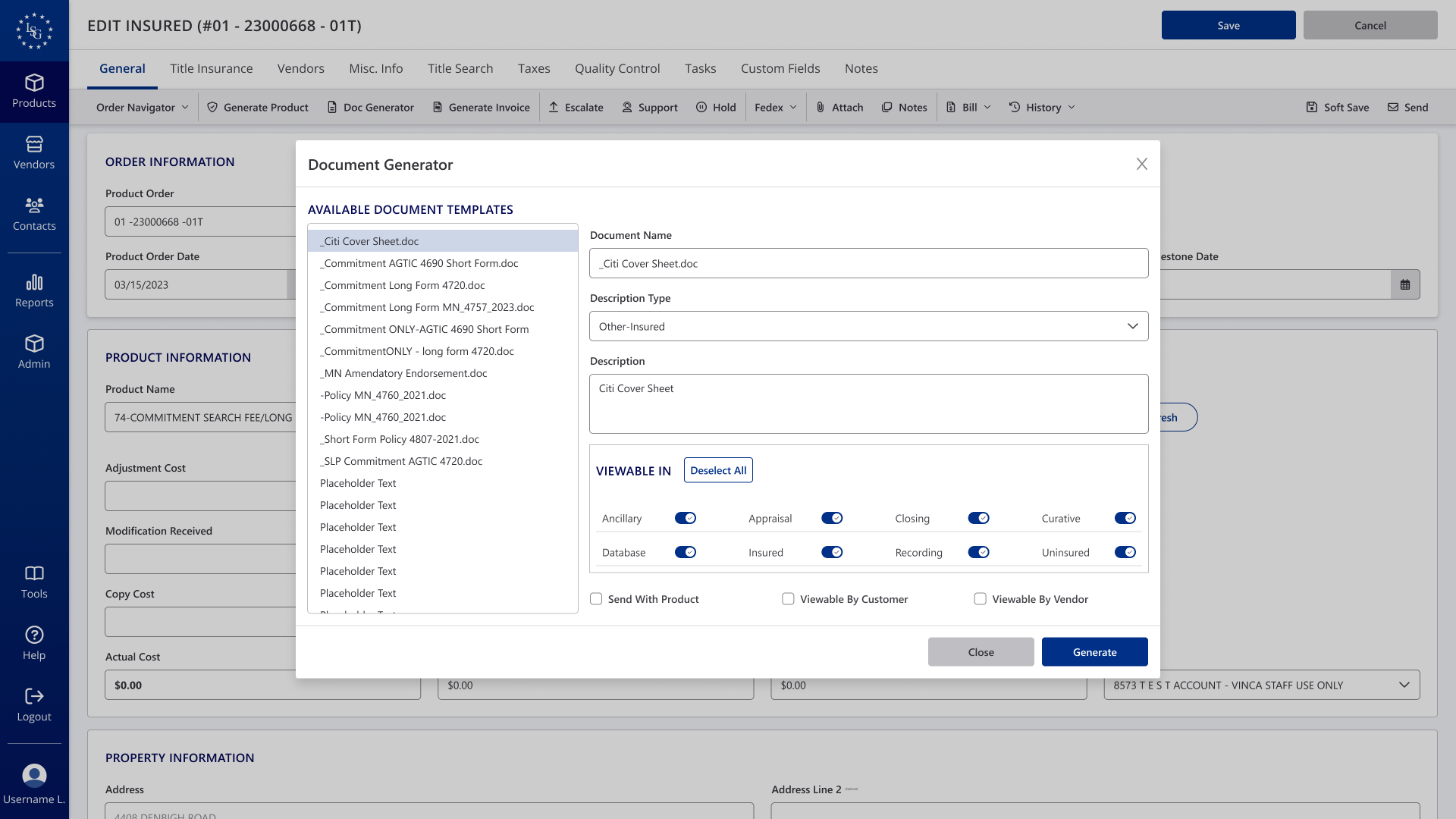
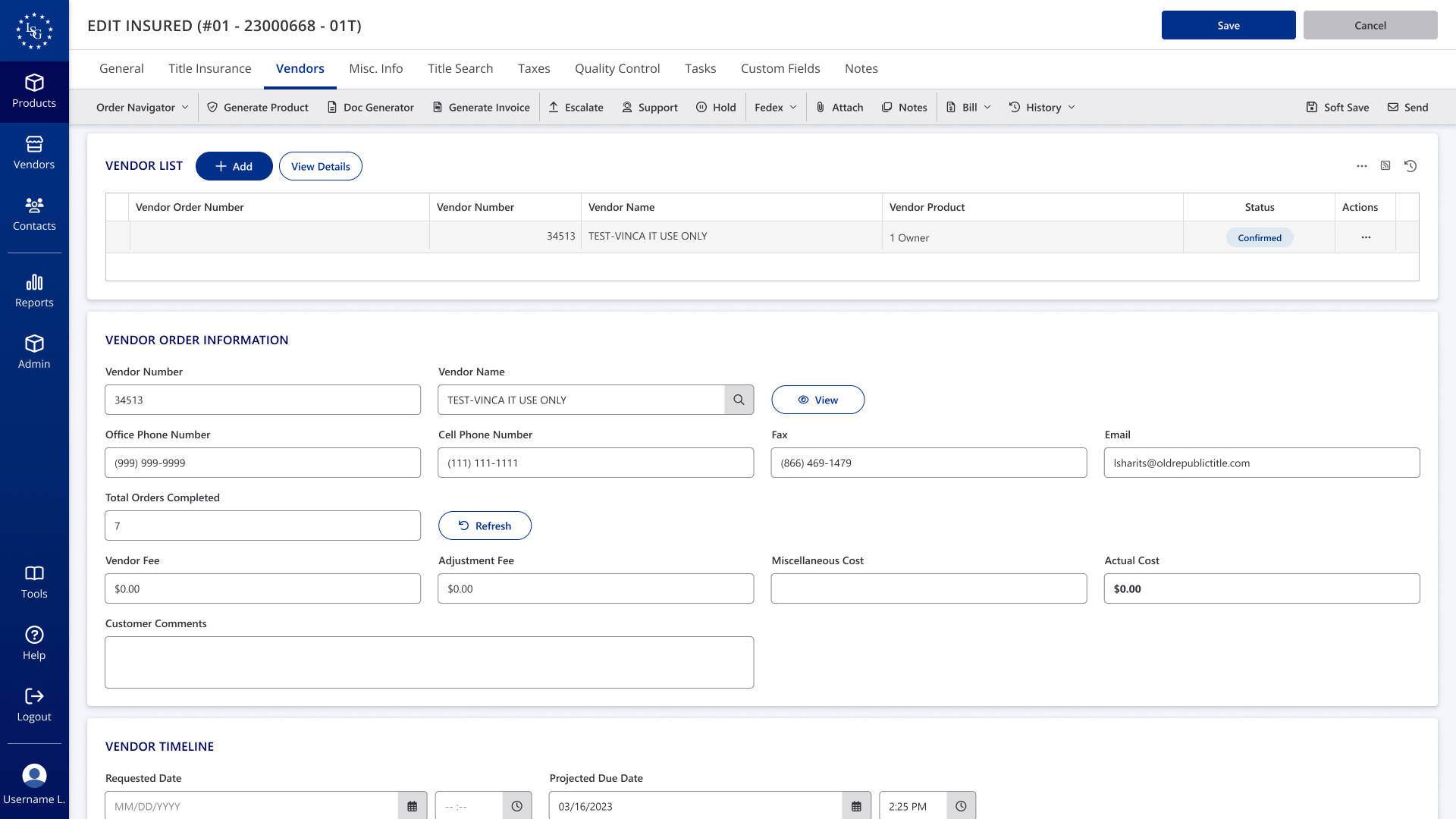
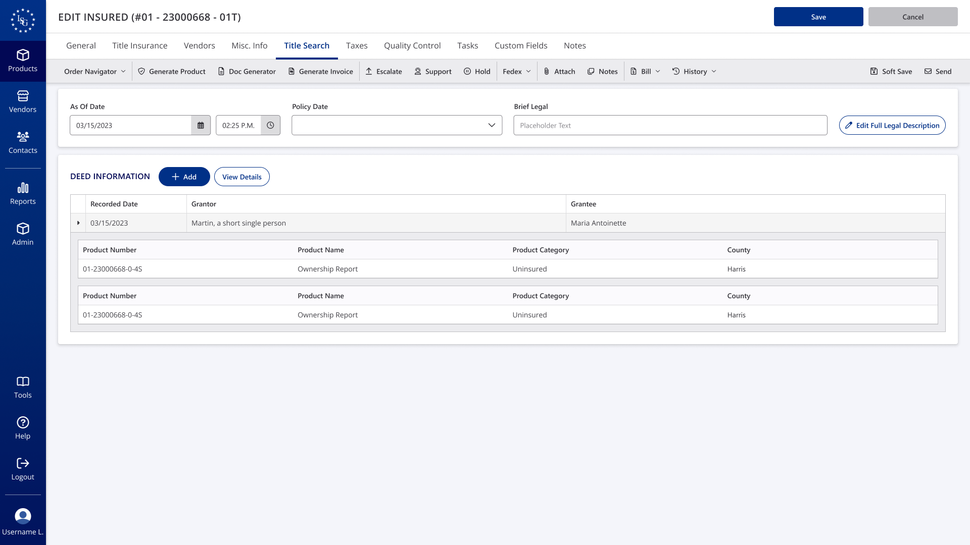
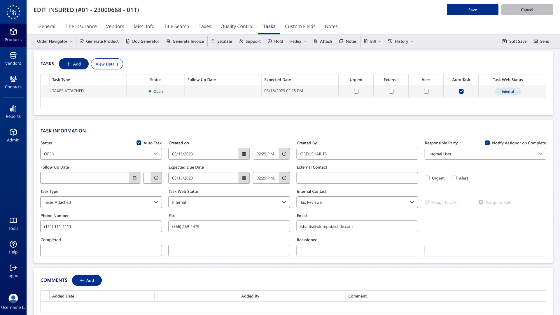
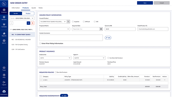
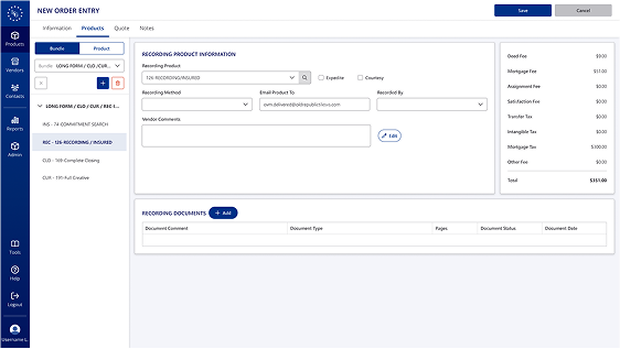
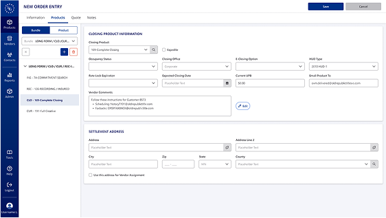
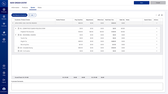
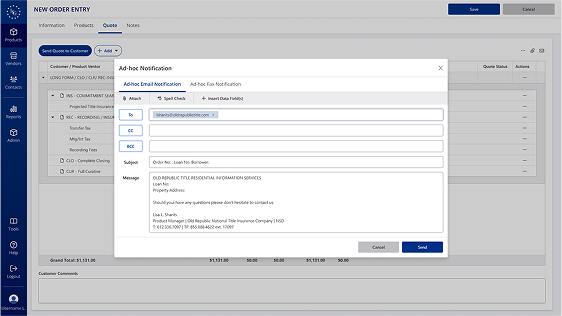
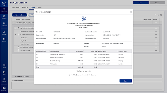
One of Vinca’s key features is the ability to pull customer information by searching for a customer number. In the legacy interface, hyperlinks and dropdowns offered limited functionality, so I enhanced these fields with searchable lookup components to improve usability. To ensure continuity for existing users, I maintained the familiar entry flow while modernizing its look and behavior. I explored multiple iterations of the Bundle/Product selection and, based on stakeholder feedback, kept the selection in the side panel—replacing the radio buttons with tabs for better clarity. One of the most significant UI improvements was the redesigned Order Confirmation modal. I elevated its visual design using ORT branding, creating a polished, professional interface that’s also email-ready. To establish a scalable layout for future Vinca modules, I implemented a card-based format across all sections.
Before
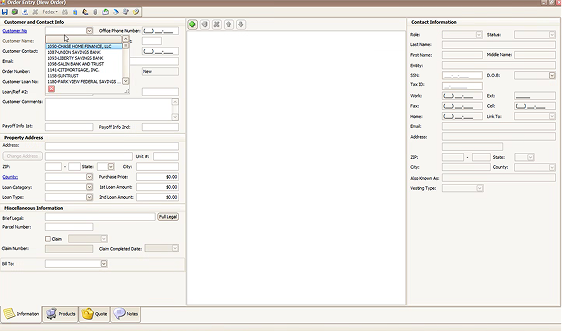
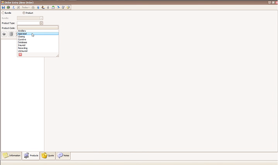
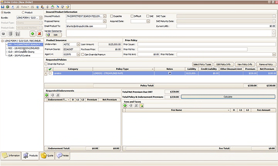
After
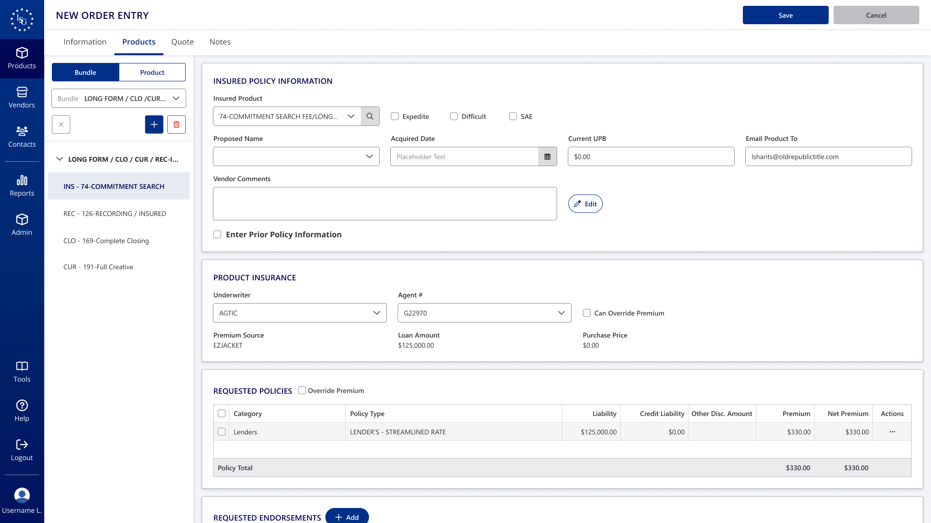
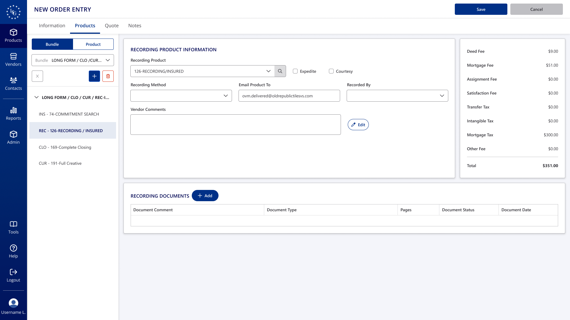
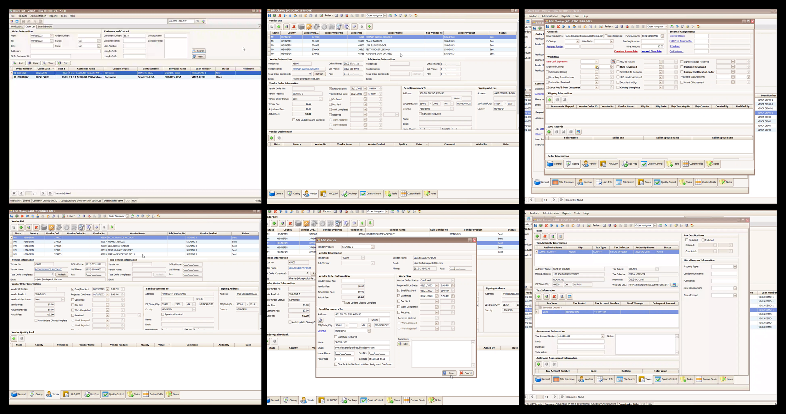
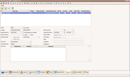
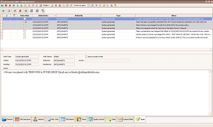
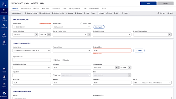
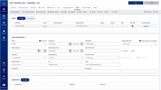
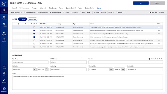
Edit Product
A key challenge in the redesign was clarifying the hierarchy of tools. In the old version, unlabeled icons were placed beneath the navigation bar, with an additional row of different icons appearing depending on the selected tabs. These tabs were placed at the bottom of the page, making navigation unintuitive. In the updated design, I streamlined the navigation and toolbar, added supporting labels to all icons, and replaced them with updated icons from FontAwesome.
Before

After
Feedback and Iterations
My team collaborated closely with the product team and stakeholders, regularly presenting prototypes to gather feedback and align on direction. We also worked alongside the development team to ensure that UI changes and new implementations were technically feasible. When blockers arose—whether due to technical constraints or shifting product requirements—I revisited the designs and adjusted accordingly. After several iterations, the final design was approved for development.
Final Design
Conclusion
Redesigning Vinca highlighted the importance of strategic UX and design in modernizing legacy systems.
The challenge of redesigning Vinca was to modernize a legacy system while maintaining a familiar experience for existing users. The core objective was to streamline workflows, enhance usability, and transition Vinca into a scalable, SaaS-ready product. By focusing on user-centered design and aligning with the Old Republic Title Design System, we optimized the interface without sacrificing essential functionality.
Through regular collaboration with the product, development, and stakeholder teams, we iterated on prototypes to ensure both technical feasibility and user satisfaction. Key updates included simplifying the navigation, consolidating information, and introducing a more intuitive, card-based layout for future scalability. The final design achieved a balance between modern design principles and legacy requirements, setting Vinca up for future growth while keeping the user experience familiar.